3
Why the industry cares so much about packaging – the silent salesman
Packaging design is a major way of differentiating and promoting brands, being particularly important in homogenous consumer products such as cigarettes where, like bottled water, few objective differences exist. (81) Marketing literature routinely highlights the critical role played by pack design in the overall marketing mix, emphasising that the ‘product package is the communication life-blood of the firm’, the ‘silent salesman’ that reaches out to customers, (82) and that packaging ‘act[s] as a promotional tool in its own right.’ (83)
Colours and typeface have long been known to elicit particular responses in consumers, often shaped by strong social and cultural forces.1 Imagery and symbols also exert powerful effects, linking desirable attributes with particular brands. Cigarette packaging conveys this crucial sense of brand identity through logos, colours, fonts, pictures, packaging materials and shapes. For example, the world’s most popular cigarette brand, Marlboro, (84) can readily be identified through its iconic red chevron (see Figure 3.1). The powerful association of the bold colour red with Marlboro is embodied in Philip Morris International’s continued multi-million dollar sponsorship of the Ferrari Formula 1 racing team, despite the fact that neither the official logo nor brand name appears on the red race car (see Figure 3.2). In 2013, the Marlboro brand was estimated to be worth $US69 billion, making it the eighth most valuable brand in the world, just behind Microsoft and Coca-Cola. (85)
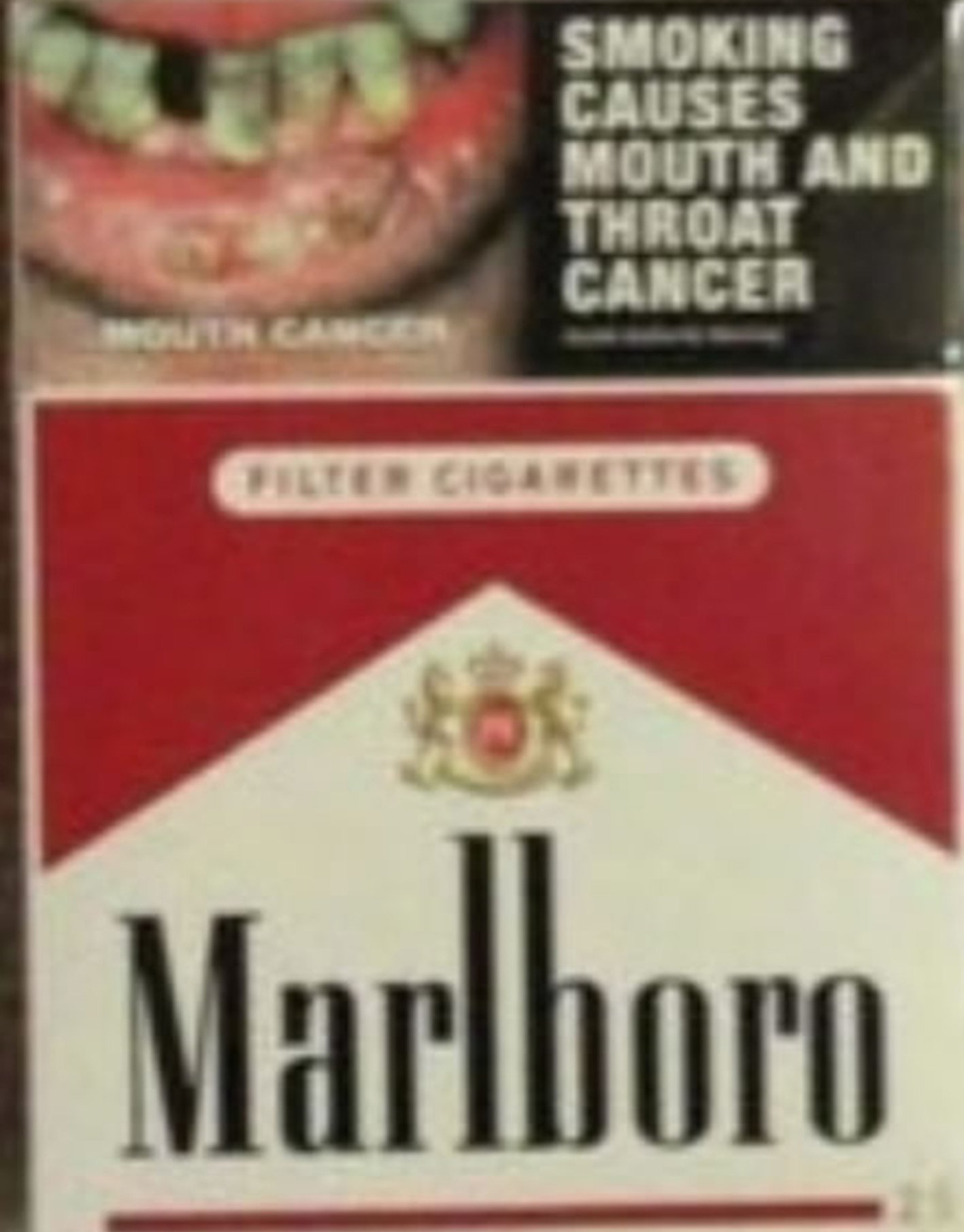
Figure 3.1 The Marlboro brand as it appeared in Australia prior to the plain packaging reforms. Source: Becky Freeman private collection

Figure 3.2 The 2014 Scuderia Ferrari Formula 1 car. Source: Official Scuderia Ferrari Formula 1 team website http://tiny.cc/n7fqox
The importance of packaging in promoting tobacco use
The tobacco industry has always claimed that it has no interest in attracting new, non-smoking customers but is interested only in stimulating brand-switching among current smokers and in maintaining brand loyalty in current customers. Notwithstanding the commercial absurdity of any industry professing disinterest in attracting new recruits to its products, this position has been comprehensively undermined by a multitude of revelations from internal industry documents that candidly acknowledge the vital importance of attracting new smokers (predominantly youth). (86–93)
These internal documents confirm that companies have invested heavily in pack design in order to communicate specific messages to specific demographic groups including young people. (43, 91) In the early 1990s a presenter addressing marketing staff at Philip Morris remarked that smokers: ‘are ready for change’ and ‘once exposed to innovative [packaging] especially young adults see their current packaging as dated and boring’. (94) The presenter said packs aimed at younger women should be ‘slick, sleek, flashy, glittery, shiny, silky, bold’. (94) In designing tobacco packs, the tobacco industry counts among potential purchasers those already smoking the brand, those smoking other brands and those not yet smoking but who might be persuaded to take it up.
If, as the tobacco industry contends, cigarette pack design is primarily intended to convey important consumer information, then very few facts are being shared with smokers. Tobacco packaging has historically carried very little ‘information’. Internationally, apart from showing the brand and variant names, the manufacturer’s name, the number of cigarettes in the pack (all required components under plain packaging laws) and, in some countries, nicotine and tar levels, cigarette packs rarely contain any other information. Furthermore, misleading on-pack descriptors like ‘light’ or ‘mild’ are now restricted in several jurisdictions. Cigarette packaging then plays an essential role in differentiating one product from another. The industry has long known that different brands of similar cigarettes are often indistinguishable to smokers. As an industry document from 1979 explained, ‘one of every two smokers is not able to distinguish in blind (masked) tests between similar cigarettes.’ (95)
In 1975, the government of Norway introduced what was then the world’s most comprehensive ban on tobacco advertising. Yet a 2003 study conducted with young adult Norwegian smokers aged 18–23 (born five to 10 years after the ban) highlights how the tobacco industry continued to market to this demographic through persuasive cigarette pack design. This study showed that cigarette brands and cigarette package designs gave meaning to personal characteristics, to social identity and to positions in status hierarchies. In the young smokers’ accounts, brands appeared to add ‘an extra dimension to the social meaning of smoking in their daily life.’ (96) With the increasing prevalence of tobacco advertising and sponsorship bans throughout the world, the pack has fast become the most important promotional vehicle for reaching potential and current smokers. (43, 97–102)
Several nations have now banned the open display of tobacco products in retail locations. Point-of-sale displays have been found to be highly visible and persuasive forms of promotion.
Power walls and counter top displays are highly visible and eye-catching. They present an unavoidable and unfortunate spill of promotional imagery and product reminders to vulnerable consumers including young people, former smokers . . . and smokers of all ages who are trying to quit. (103)
With removal of point-of-sale as an opportunity for promotion, BAT and Philip Morris (104) have predicted that, in the future, pack design alone will drive brand imagery. Unless governments impose complete restrictions on packaging design, bans on the retail display of tobacco will encourage a further shift in industry investment towards innovative pack design, with the pack functioning as the only remaining vehicle for product promotion. The industry trade journal Tobacco Journal International states it best:
When most media advertising is illegal and even promotion at point of sale is under threat, the pack itself is the last chance saloon for tobacco company brand managers to sell their products to the smoking public. (105)
Pack design can not only communicate the ‘personality’ of a cigarette brand to the smoker, but smokers can project these characteristics by handling and displaying the package throughout their daily routines. (43) Once again the tobacco sector provides the most succinct summary as to why this is so essential:
Today, with restrictions in advertising, when the pack is seen in the hands of the right person, it is surely the best product placement that a cigarette company can get for free. This personal appeal is a major aspect driving cigarette packaging design. An attractive pack is something smokers want to be seen with. (106)
Just as designer clothing, accessories and cars serve as social cues to style, status, values and character, so too can cigarette packs signify a range of attributes about users. As ‘badge products’ cigarettes can reinforce the characteristics conjured by brand image. (43, 107–110) This behaviour not only affects the single consumer, but also exerts a powerful effect on their friends, associates and even casual contacts. Consumer theory and research has demonstrated that incidental brand encounters (ICBEs) powerfully affect buying patterns in ways in which the consumer is not fully aware. A series of four studies by Ferraro, Bettmand and Chartrand published in the Journal for Consumer Research in 2008 found that repeated exposure to simulated ICBEs:
. . . increases choice of the focal brand among people not aware of the brand exposure, that perceptual fluency underlies these effects and these effects are moderated by perceivers’ automatic responses to the type of user observed with the brand. (111)
Minimising the effect of health warnings
The other important goal of packaging design that is unique to tobacco products is to use the pack to obscure, downplay and minimise government-mandated health warnings. Again, the industry is refreshingly candid about this challenge.
Tobacco product packaging is a paradox in paper and cardboard. Like any [fast moving consumer good], a cigarette pack aims to attract the eye, display the brand to advantage, and generally look cool. However, the difference between tobacco and other industries is that, in looking at the packaging, the consumer is also looking at a health warning. One might forgive a pack designer coming to the conclusion that the less a consumer looks at a cigarette pack, the better. But packaging developments demonstrate a different mindset, with tobacco product manufacturers competing with their rivals just as fiercely as confectionery and soap manufacturers. (105)
This effect is reflected in the results of plain pack research that shows consistently that pack brand imagery distracts from and reduces the impact of health warnings. Students have been found to have an enhanced ability to recall tobacco health warnings on plain packs than on branded packs. (23, 28) Health warnings printed on plain packs are seen as being more serious than the exact same warnings printed on branded packs. These findings suggest that positive brand imagery diffuses the overall impact of health warnings. (112) For example, in 2010 a Benson and Hedges superslims cigarette pack from Canada incorporated the required graphic health warning so that the pack appeared to be reminiscent of a digital music player (see Figure 3.3). The small size of the superslims pack also significantly reduced the size of the graphic health warning (as warnings were then required to be 50% of the surface area of the front of the pack, not a specific size) potentially further reducing its impact.
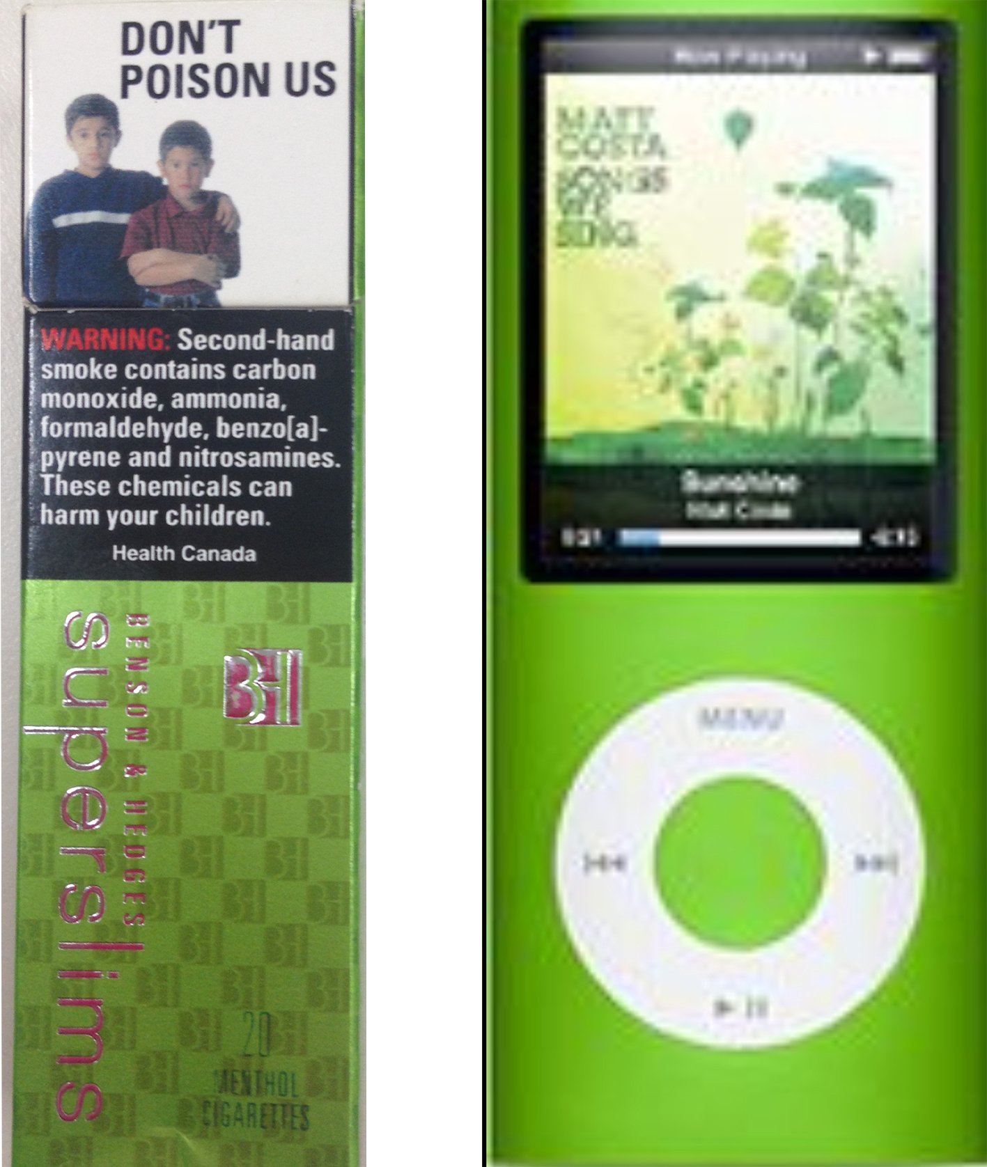
Figure 3.3 Comparison of Benson and Hedges superslims cigarette packaging to a digital music player. Source: Becky Freeman private collection
Other packaging designers have confirmed that branding elements on packs are essential for differentiating brands, even in the face of graphic health warnings:
Although the warnings, graphic or otherwise, cannot be said to enhance the aesthetics of the pack, they function separately from the branding in communication terms. Because they are on all packs, they do not differentiate one brand from another, whereas the branding device, colours and other elements of the identity enable consumers to readily recognise their chosen brands. (106)
Subverting bans on light and mild descriptors
The industry has also found that packaging design is a useful way to work around legislation meant to protect consumers from misleading product descriptors. In nations where the deceptive descriptors ‘light’ and ‘mild’ have been banned, manufacturers have used packaging innovations to subvert the intent of those bans (113) where different colour gradations and intensities are used to perpetuate smokers’ understanding that a brand is allegedly lower or higher yielding.[14] For example, Derby cigarettes in Brazil substituted red for full strength cigarettes, blue for mild, and silver for light (see Figure 3.4). (114)
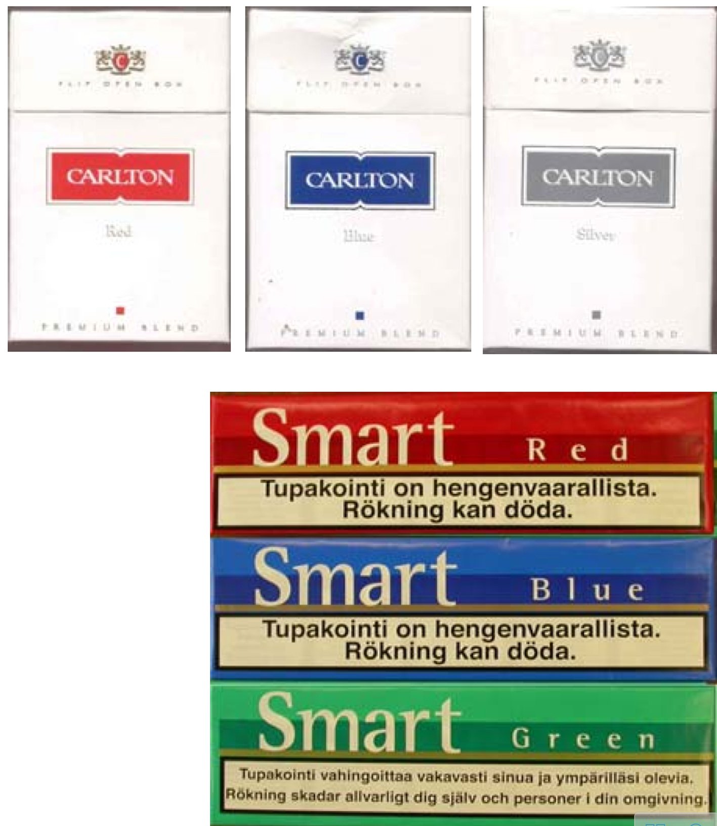
Figure 3.4 Brazil: cigarette manufacturers substituted red for full strength cigarettes, blue for mild, and silver for light. Source: http://www.smoke-free.ca/pdf_1/Endingthedeception-2005.pdf
Cigarette packaging as a key aspect of marketing
Several insightful and illustrative statements have been made by industry insiders about how influential brand and package design is in the repetitive, daily ritual of carrying, opening and displaying cigarette packs. The recurring and ingrained use of cigarettes is reflected in the physical properties of the packages themselves.
If you smoke, a cigarette pack is one of the few things you use regularly that makes a statement about you. A cigarette pack is the only thing you take out of your pocket 20 times a day and lay out for everyone to see. That’s a lot different than buying your soap powder in generic packaging. (115)
Packaging styles convey an essential advertising image: Packaging design, structure, and graphics play an integral part in brand image, which, along with tradition, plays a heavy role in tobacco sales. Handled an average of 20 or more times a day, cigarettes are carried in pockets and purses, and displayed on counters, bars, desks, and coffee tables. Brands display an image in the same way as clothing, car, and restaurant choices. (116)
When we offered them Marlboros at half price – in generic brown boxes – only 21% were interested, even though we assured them that each package was fresh, had been sealed at the factory and was identical (except for the different packaging) to what they normally bought at their local, tobacconist or cigarette machine. How to account for the difference? Simple. Smokers put their cigarettes in and out of their pockets 20 to 25 times a day. The package makes a statement. The consumer is expressing how he wants to be seen by others. (117)
The tobacco industry, and its service providers such as printing and packaging companies and advertising agencies, offer unique and telling insights into the myriad of opportunities that packaging presents to reinvigorate flagging brands and sell everything ‘old as new again’. Any naivety in assuming a package is primarily to serve as a safe container for goods is swiftly refuted by this quote from a packaging industry consultant, who said that: ‘Packaging is the embodiment of all the time, money and resources invested in building a consumer packaged good.’ (118) It should be no surprise that the tobacco industry is fiercely protective of this investment, and is constantly seeking to improve pack design.
The tobacco industry trade magazine, World Tobacco, contains numerous examples of appeals to manufacturers to use packaging as an advertising vehicle. (98, 99, 102, 119–121) Manufacturers were advised:
If your brand can no longer shout from billboards, let alone from the cinema screen or the pages of a glossy magazine . . . it can at least court smokers from the retailer’s shelf, or from wherever it is placed by those already wed to it. (101)
Packaging designers remained optimistic about opportunities to increase the appeal of cigarette packs despite intrusive health warnings:
With the uptake of printed inner frame cards, what we will increasingly see is the pack being viewed as a total opportunity for communications – from printed outer film and tear tape through to the inner frame and inner bundle. Each pack component will provide an integrated function as part of a carefully planned brand or information communications campaign. (122)
One packaging firm urged tobacco companies to skirt ‘draconian legislation’ by using pack over-wrapping to create an in-store advertisement.
Where cigarette advertising is banned by law . . . the retailer can ‘quite coincidentally’ stack up a kind of billboard using the products at the point of sale if, for example, the cigarette cartons of a particular brand bear different parts of an overall design, which complete a puzzle or a caption when stacked up. (98)
Advances in printing technology have enabled printing of on-pack imagery on the inner frame card, (122) outer film and tear tape, (98) and the incorporation of holograms, collectable art, metallic finishes, (123) multi-fold stickers, (99) photographs and images in pack design. (124–126) In the early 1900s, collectable cigarette cards were a major form of in-pack promotion. (127) A contemporary return to the package as the primary source of advertising is apparent in numerous international examples.
Trends in tobacco industry pack design
Australia is a quintessential ‘dark market’ where all tobacco advertising is banned.[56] Subtle changes to cigarette packs and trademarks were observed on both Benson & Hedges and Winfield cigarette packs during 2000–2002. (42) When researchers called the company to inquire about the changes, an employee said they were ‘playing with the logo because we can’t do any advertising anymore.’ (42)
British American Tobacco Australia (BATA) introduced split Dunhill packs in October 2006 (see Figure 3.5). (128) The pack could be split along a perforated line to create two mini packs, easily shared between two smokers perhaps unable to afford a full pack. Children, with limited pocket money, might be attracted to such an opportunity. Once split, one of the two packs did not bear the mandatory graphic health warning. BATA was forced to remove the packets from the market when they were found to be in breach of tobacco product health warning labelling laws. (129)
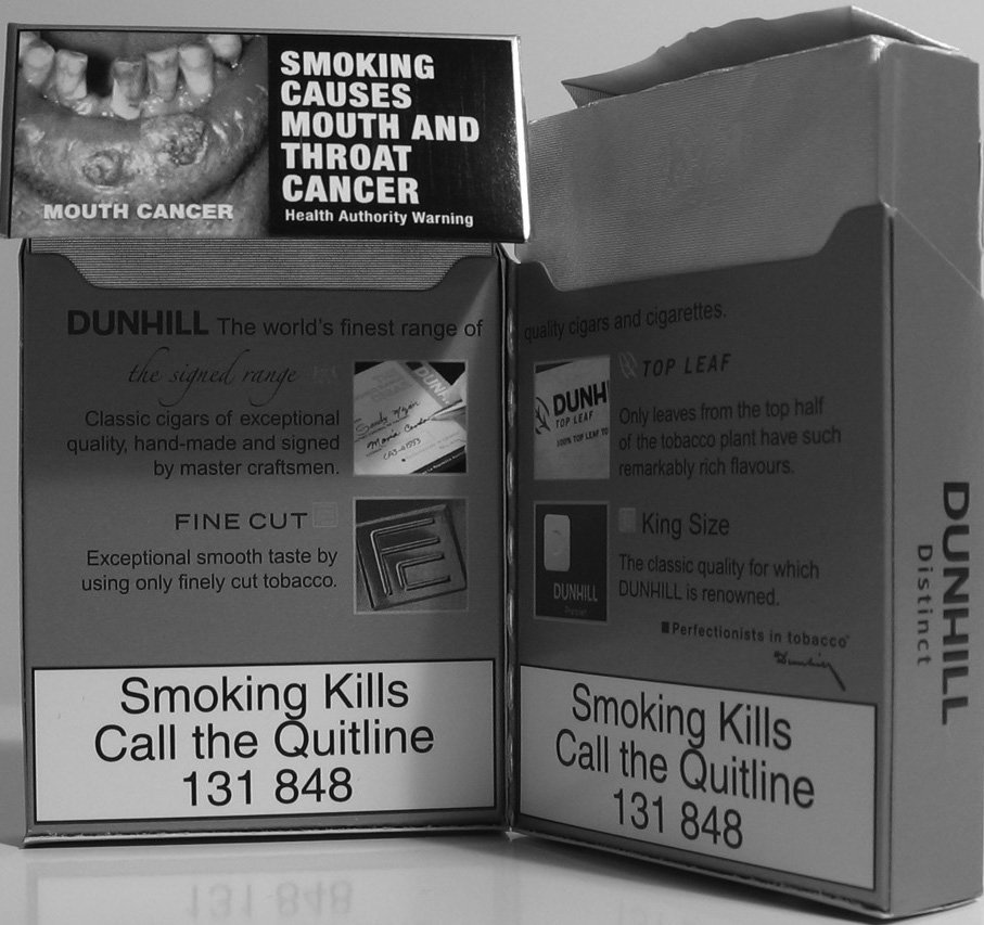
Figure 3.5 Split package of Dunhill cigarettes. Source: Quit Victoria.
In June 2005, Imperial Tobacco Canada introduced octagonal packs for the du Maurier brand, presenting an eye-catching package but also obscuring the health warning by wrapping it around the angled pack sides (see Figure 3.6). (130) Imperial’s vice president of marketing received an international industry award for theinnovative design, ‘considered an outstanding example of the capacity of product packaging to influence the end user.’ (131)
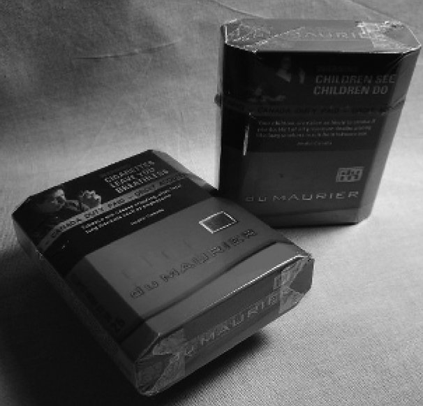
Figure 3.6 Octagonal packs for the du Maurier brand. Source: http://tobaccocontrol.bmj.com/cgi/content/full/15/3/150-a
In August 2006, BAT New Zealand packaged its Benson & Hedges brand in collectable tins, priced identically to those sold in cardboard packs; the required government issued health warning was affixed to the tin with an easily removed sticker. (132)
In December 2006, KT&G, Korea’s largest tobacco manufacturer, released new packaging for the Raison D’etre brand. The pack featured a ‘variety of colourful designs, including graffiti, Indie band, B-boy and X-sports’ (see Figure 3.7). (133) The one month limited pack release sought to create a sense of product scarcity, a common marketing tactic to enhance product desirability. (134)

Figure 3.7 KT&G packaging for the Raison D’etre brand. Source: http://www.djtimes.co.kr/news/articleView.html?idxno=28832
Launched in December 2004 by the Thailand Tobacco Monopoly, Chopper (as in Harley Davidson motorcycles) was described as ‘one of the most complex and in-depth package design undertakings.’ (135) The name and motorcycle imagery reflects the popularity of motorcycles in Thailand.
In February 2007, RJ Reynolds (RJR) launched a new Camel cigarette aimed at women. Camel No 9 is packaged in black and pink or teal (menthol variety) and designed to conjure images of sophistication, referring to being ‘dressed to the nines’ (Figure 3.8). (136) Women’s internet sites featured positive commentary about the new packaging:
. . . with me being female and all, I have to say that the box and the pink foil inside are appealing, as is the actual look of the cigarette itself. (137)
. . . yeah my husband bought them for me last night, because I was so turned on by the black and pink package. (137)
I don’t smoke at all, but I keep seeing this [sic] ads for Camel No 9. The packaging alone makes me want to try them. It just looks damn good and doesn’t follow that style that seemingly every other carton out there does. (138)
It is not possible to determine if these comments were posted by real women, public relations people, or by RJR employees.
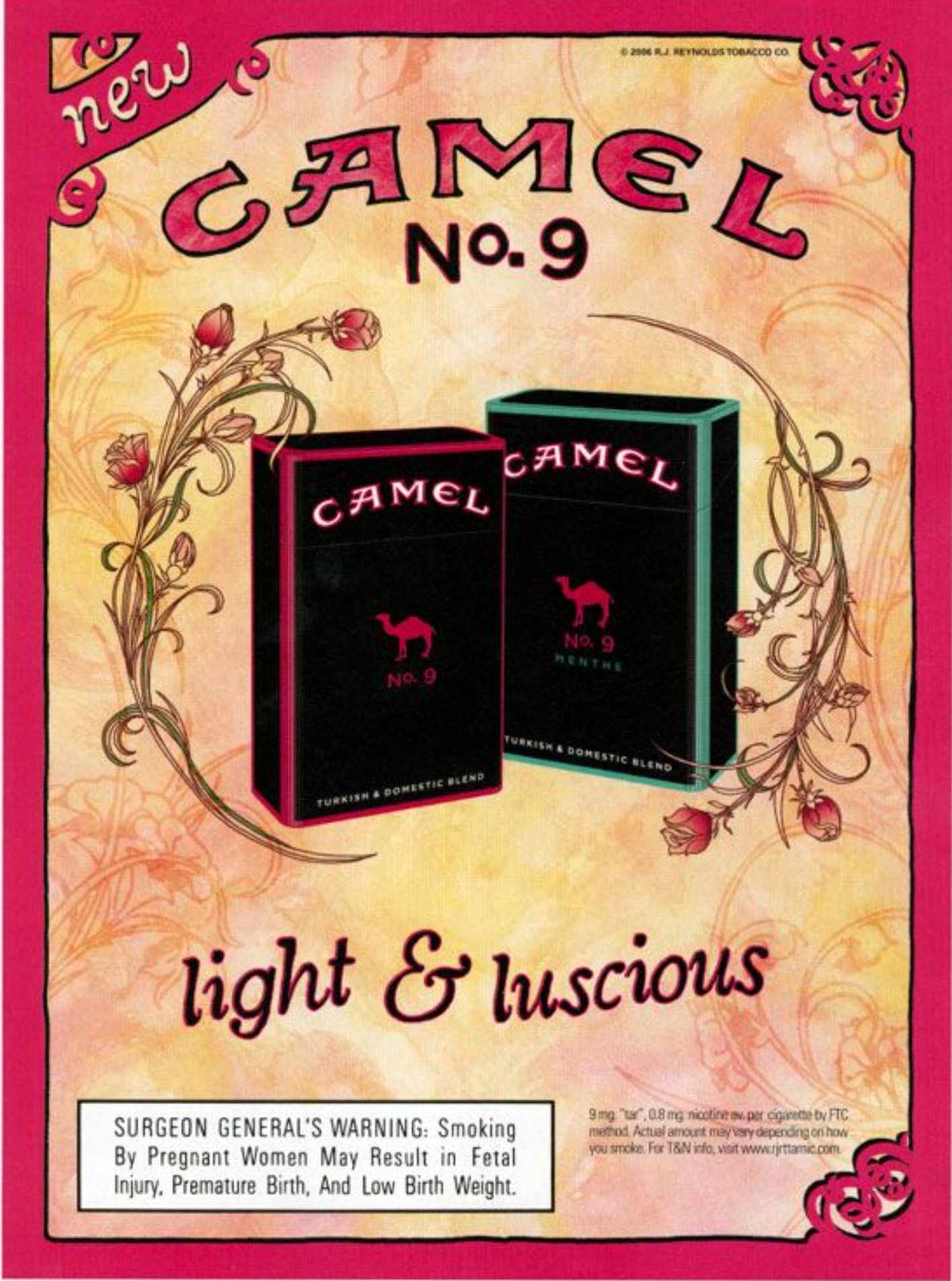
Figure 3.8 RJ Reynolds Camel No 9 cigarette aimed at women. Source: http://tiny.cc/e6iqox
RJR has proven to be particularlyinnovative in designing cigarette packaging. In 2007, smokers were recruited to rate and propose pack designs and logos. Consumers were directed to the Camel brand website and blog, where they could discuss package design and vote on what they wanted to see as a final concept. (139) The project, which was initially targeted to engage 6,000 people, netted 30,000 participants and resulted in four new flavours with eye-catching package designs being introduced onto the market (Figure 3.9). These four flavour and package variants were dubbed Frost, Mellow, Robust, and Infused. The cigarettes contain a small bead in the filter that delivers the unique flavours. The Camel Signature Blends packaging designs were subsequently modified for the retail market due to the cartoon-like imagery violating US advertising codes that tobacco packages not be appealing to children.

Figure 3.9 Open source package designs for the Camel Signature Blends – from left to right – Frost, Infused, Robust and Mellow.
Researchers from the Centre for Tobacco Control Research at the University of Stirling documented numerous changes in UK tobacco packaging following the introduction of comprehensive legislation banning tobacco advertising, promotion and sponsorship. (140–143) Packaging design strategies were categorised into key themes:
- value-based packaging
- selling products in smaller pack sizes
- selling products in pack sizes larger than the traditional 20 cigarette and 12.5 grams of tobacco
- revamping the packaging of brands traditionally seen as value
- simplifying designs to communicate value-for-money
- printing the price on the brand to imply a special low price
- image-based packaging
- designing packs to appeal to various segments of the market, in particular younger and female smokers
- novel or innovative packaging
- novel ways of opening the pack
- novel shapes and sizes
- novel materials
- themed packs to encourage collection of sets
- environmentally sustainable packaging.
- sustainably produced packaging
- Rizla rolling papers certified by the Forest Stewardship Council.
Evidence supporting the likely effectiveness of plain packaging
The bulk of evidence about the possible impact of plain packs necessarily derives from experimental studies where subjects have typically been presented with both branded and mocked-up plain packs and asked about associations and preferences. A 2009 review of the evidence on the effects of plain packaging concluded: (144)
The evidence indicates three primary benefits of plain packaging: increasing the effectiveness of health warnings, reducing false health beliefs about cigarettes, and reducing brand appeal especially among youth and young adults. Overall, the research to date suggests that ‘plain’ packaging regulations would be an effective tobacco control measure, particularly in jurisdictions with comprehensive restrictions on other forms of marketing.
International research on plain packaging
In 1995 an expert panel provided the Canadian health department with a comprehensive review of the likely effects of plain packaging entitled When packages can’t speak: possible impacts of plain and generic packaging of tobacco products. (27) Until that time, only four sets of studies had been conducted on the plain packaging of cigarettes. (23, 26, 117, 145, 146) The expert panel found that all four studies produced some evidence to support the hypothesis that plain and generic packaging made cigarettes less attractive and less appealing.
The expert panel also conducted a series of studies to further assess the potential impact that plain packaging would have on smoking uptake, health warning recall and cessation, and evaluated the expected tobacco industry response to any packaging reforms. They found that teenagers were particularly vulnerable to linking specific tobacco brands to specific types of people and that tobacco brands served to help teenagers establish their own self-image. (147) On the basis of a detailed analysis of the findings of all the studies, the expert panel concluded:
Plain and generic packaging of tobacco products (all other things being equal), through its impact on image formation and retention, recall and recognition, knowledge, and consumer attitudes and perceived utilities, would likely depress the incidence of smoking uptake by non-smoking teens, and increase the incidence of smoking cessation by teen and adult smokers. This impact would vary across the population. (27)
Since the Canadian expert review, further research has been conducted in Canada, (28, 112, 148–152) Australia, (153–156) the United Kingdom, (157) New Zealand (158) and the United States. (159) This research has focused on the effects of plain packaging on: awareness, recall and impact of health warnings, (23, 160) on perceptions of riskiness of tobacco products, (28, 150, 157, 159) and the appeal of brands and products. (26, 145, 148) (151–156, 158) Overall, this body of research confirms and strengthens the original findings of the Canadian expert panel.
Impact of plain packaging on effectiveness of health warnings
A multi-country tobacco survey examining the effectiveness of warnings showed that smokers in Canada, who were at the time of the study, exposed to large, picture-based warnings, were significantly more likely than others to report thinking about the health risks of smoking, to stop themselves from having a cigarette, and to think about quitting because of the health warnings. (161) The same study also showed that the larger and more prominent a health warning, the more likely it was to be recalled. Plain packaging enables the warning size to be increased and allows for additional information, elaborating on warnings and about smoking cessation, to be printed on packs.
An Australian study specifically explored the question of whether removing the colour and design features of packaging was more effective in reducing theappeal of brands than simply increasing the size of health warnings. (156) The study found that once packs were plain, increasing the size of the front-of-pack health warnings from 30% to more than 70% did not further reduce brand appeal. While other research indicates that larger health warnings are likely to be noticeable and memorable to consumers, in this study plain packaging was more effective than further increasing the size ofhealth warnings in reducing the brand appeal.
A New Zealand study (158) examined the combined effects of health warnings and plain packaging on the likelihood of young adults aged 18 to 30 years engaging in behaviours known to be linked to cessation. Smokers in this study were asked which pack they would be most and least likely to choose when presented with four cigarette packets featuring different branding and warning size combinations. Packs with the greatest number of branding elements were still preferred even when the warnings were increased from 30% to 50%. However they were less likely to be chosen with a 75% warning. Plain packets with 75% health warnings were significantly more likely to elicit stronger cessation-linked intentions, such as reducing the amount smoked, increasing quit attempts and seeking help to quit, than branded packs with a 30% front-of-pack warning.
Impact of plain packaging on perceptions of harmfulness
Unregulated package colouring and imagery contributes to consumer misperceptions that certain brands are safer than others. (43, 104, 150, 162) The colour of packs is also associated with perceptions of risk and brand appeal. Marlboro packs with a gold logo were rated as lower health risk by 53% and easier to quit by 31% than Marlboro packs with a red logo in a study of UK adult smokers. (157) A study of 8243 smokers from the US, the UK, Canada and Australia in 2006 similarly found that smokers of ‘gold, silver, blue or purple brands were more likely to believe that their own brand might be a little less harmful’ than smokers of red or black brands. (159) Researchers in both studies concluded that removing colours from packs, as well as misleading terms such as smooth, gold, and silver, would significantly reduce false beliefs about harmfulness.
Impact of plain packaging on reducing the appeal of products
An Australian study involving more than 800 adult smokers examined the effects on the appeal of tobacco products as the amount of pack branding was progressively reduced. As illustrated in Figure 3.10, the plainest packs were seen as less attractive (brand/pack characteristic), smokers of the packs were seen as significantly less stylish and sociable (smoker characteristic), and the cigarettes in the packs were thought to be less satisfying and of lower quality (sensory perception). (154)
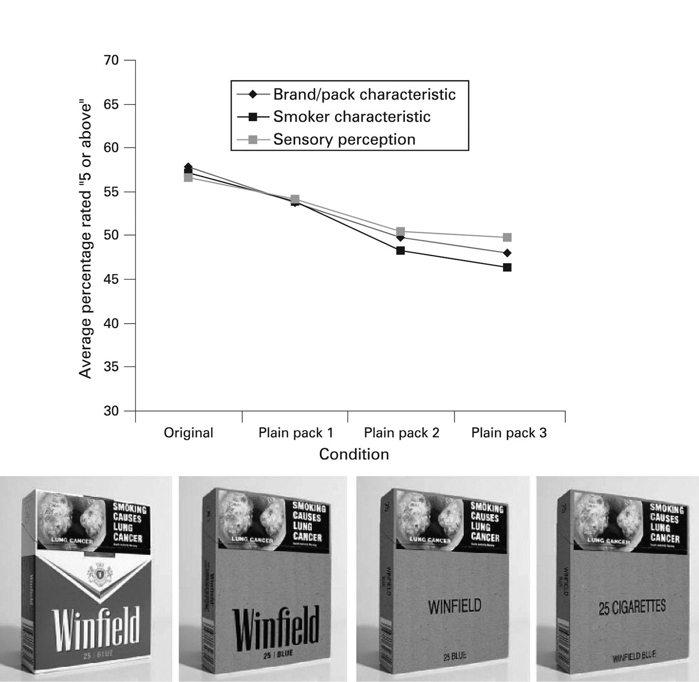
Figure 3.10 Level of attractiveness of increasingly plainer tobacco packaging. Source: Wakefield MA, Germain D and Durkin SJ. How does increasingly plainer cigarette packaging influence adult smokers’ perceptions about brand image? An experimental study. Tobacco Control 2008;17:416–21. (154)
A similarly designed study involving adolescents found that progressively removing brand elements such as colour, branded fonts and imagery from cigarette packs resulted in adolescent smokers seeing packs as less appealing, having more negative expectations of cigarette taste and rating attributes of a typical smoker of the pack less positively. (155)
Canadian studies (151, 152) examined the effects of removal of brand imagery on young female smokers aged 18 to 25 years. The researchers found that removing both descriptors and colours from packs substantially reduced the appeal of female-oriented brands for female smokers. For example, the appeal of the most desirable brand in the study, Capri Cherry, fell from 67% to 17% among women who viewed plain packs without the descriptor ‘Cherry’ on the pack. Plain packs were also associated with significantly fewer positive characteristics than fully branded packs, including glamour, being slim, popular, attractive and sophisticated. Among smokers who requested a pack at the end of the study, branded packs were three times more likely to be selected than plain packs. The researchers concluded that ‘plain packaging and removing descriptors such as ‘slims’ from cigarette packs may reduce smoking susceptibility among young women.’ (152)
Research has continued into many aspects of pack and cigarette design and the likely effects of standardisation. This has been summarised in a review for the UK government (76) and most recently by Hammond for the Irish government (163).
1 Portions of Chapter 2 are drawn from: Freeman B, Chapman S and Rimmer M. Review: the case for the plain packaging of tobacco products. Addiction 2008;103:580–90. and Scollo, M and Freeman B. Packaging as Promotion. Tobacco in Australia. 2012. Available from: http://tinyurl.com/nf44zrv