5
Practical tools for CQI in primary health care
Many tools have been developed for implementing CQI in health care. Selecting or adapting the best tools to suit the quality improvement needs of your primary healthcare (PHC) practice or service and your client population can be challenging. This chapter describes some practical tools that have been found to be useful at the health centre level for examining variation in clinical care and identifying priority areas for improvement. We introduce tools for assessing PHC structures, clinical auditing, assessing and improving PHC systems, measuring client experiences of care, and improving the quality of health promotion activities. These CQI tools were developed with PHC stakeholders using participatory action research. They may help your team to draw on the sources of data and best-practice guidelines discussed in Chapter 4 to improve the quality of PHC provided by your service or practice.
We then describe some other widely used CQI tools that, while designed mainly for hospital settings, are suitable for use in PHC. We explain how CQI methods and tools relate to each other and offer tips for selecting the best methods or tools for your PHC setting and CQI purpose. We begin the chapter with an overview of the included tools and their uses.
Different tools are used for different purposes
The different tools described in this chapter are used to collect data, to organise information, to understand variation in quality, to understand relationships between processes and outcomes, to identify causes of quality problems, and to strategically and systematically set improvement goals and develop plans for improvement. Tables 5.1, 5.2 and 5.3 provide an overview of the CQI tools and techniques described in this chapter, their purpose and how they are used.
|
Tool |
Purpose |
Use in primary health care |
|---|---|---|
|
Health centre and community survey |
Gather information about the context of PHC delivery. |
Typically administered before using other tools, to understand the operating environment and structural context for PHC. Enables team to make sense of other data and plan context-specific improvement strategies. |
|
Clinical audit tools |
Assess quality of care processes and clinical outcomes |
Retrospectively measure quality of care documented in client records. Enable teams to identify priorities for improving clinical care. Used iteratively to monitor changes in quality over time. |
|
Systems assessment tool |
Assess strengths and weaknesses of PHC systems |
Used in conjunction with clinical audit and other tools. Helps teams to understand the relationships between PHC systems and care provision; to identify priorities; and to integrate strategies for system improvement. |
|
Surveys of clients’ perspectives of the quality of care |
Gather information about client experiences and satisfaction with care |
Administered routinely to help teams understand how clients and families/carers experience care. Used to inform changes for improving experiences and satisfaction. |
Table 5.1 CQI tools assessing care structures, processes and outcomes.
|
Tool |
Purpose |
Use in primary health care |
|---|---|---|
|
Health promotion audit and systems assessment tools |
Assess the quality of health promotion activities/programs |
Teams preferably use both tools to build a picture of health promotion quality and inform system changes that support health promotion activities. Can be used concurrently (and iteratively) with clinical audit tools to support a comprehensive PHC approach. |
|
Tobacco control audit tool |
Assess prevalence of smoking, support and actions for reducing tobacco-related harm |
Provides a snapshot of clients’ tobacco use and health promotion strategies relating to smoking. Enables teams to monitor change, improve responses and plan policies targeting tobacco control. |
|
Good food planning tool |
Engage communities in planning and improving local food systems |
Brings food supply and consumer stakeholders together annually to assess food security and community nutrition, set improvement goals and plan actions to strengthen local food systems. |
Table 5.2 Tools for health promotion.
|
Tool |
Purpose |
Use in primary health care |
|---|---|---|
|
Flowchart (process map) |
Visualise systems and processes |
Displays connected steps in a process, enabling teams to see interconnections, where processes work well and where flow breaks down. Used for improving and standardising a system or process. |
|
Checklist |
Identify persisting gaps and changes in routine care |
Can be collated and analysed to help teams to implement care routines in line with best-practice guidelines. |
|
Cause-and-effect (Ishikawa or fishbone) diagrams |
Organise information and understand causes of variation |
Organises and displays causes contributing to a quality effect or outcome. Enables the team to identify main factors contributing to gaps in care and priority areas for improvement. |
|
Driver diagram |
Identify causes of variation and plan change strategies |
Visualises team theory of the key drivers or contributors to achieving a project aim. Sets out causal pathways for achieving the overall project aim. |
|
Pareto diagram |
Understand variation and prioritise improvement action |
Identifies the vital few contributors to a problem. Enables teams to target improvement efforts that will lead to the greatest effect. |
|
Run chart |
Understand variation over time |
Enables teams to observe variation in data over time, track and analyse the effect of change strategies on performance. |
Table 5.3 Tools and techniques to visualise the systems and processes.
The tools described on the following pages collect data on quality indicators that relate to the structure, processes and outcomes of care.
Tools assessing care structures, processes and outcomes
Health centre and community survey
CQI data need to be analysed in relation to the operating environment for delivering care. Accurate information about care structures, available resources and the service population helps to make meaning of the data and set realistic improvement goals. It can identify operational barriers and strengths to build on when planning change.
Care structures can be systematically assessed using a simple survey tool. Administering the same survey at the start of each audit cycle enables a team to track changes in the operating environment over time.
The Health Centre and Community Survey1 developed by the Audit and Best Practice for Chronic Disease (ABCD) CQI research group (introduced in Chapter 3) is an example. The tool collects data about the health centre location (for example, urban, rural or remote setting), the population size and number of regular clients, governance arrangement, staff numbers and roles including regular visiting staff, and accreditation status.
Clinical audit tools
Measuring the quality of clinical care
Clinical audit tools focus mainly on processes for delivering and receiving care and are useful for assessing variation in care. Clinical audit tools are used to retrospectively measure the quality of care documented in client records, using indicators based on the best available evidence and the service items listed in relevant best-practice clinical guidelines.
The tools are mainly used in “audit and feedback”, in which data gathered are fed back to practitioners and used to improve service delivery. Clinical audit tools are designed to measure the quality of care for specific conditions, such as diabetes, or for important areas of PHC, such as maternal and child health. Data are collected on selected items of care that are important indicators of care quality.
Data are collected on selected items of care that are important indicators of care quality.
Some indicators are more important than others for this purpose. Blood glucose level (HbA1c), for example, is a key indicator of the overall quality of diabetes care and would always be included in an audit tool for assessing diabetes care. The audit tool would also be expected to collect data about client self-management goals, blood pressure monitoring, prescribing of medications, body weight, vision testing, interventions for smoking and alcohol use, and other important indicators in diabetes care and management. The audit tool would not usually collect data about clinical events or care processes that are uncommon for clients with diabetes: this would be onerous and time consuming for auditors and would not add valuable evidence for assessing the quality of diabetes care for a service population.2
The information collected in a clinical audit can be used in these ways:
- assess the quality of health care received by patients in line with best-practice guidelines
- identify and prioritise areas of service delivery that should be improved as part of a CQI cycle
- track changes over time in the quality of care provided (through audits that measure delivery of care in different time periods), showing whether planned improvements to care systems have resulted in better care.
Assessing care quality in areas of care where best practice is not well defined
In some areas of PHC, standards of care are not clearly articulated: evidence-based guidelines on which to base the quality indicators are limited. Where this is the case, it is possible to develop an audit process, drawing on the identification of relevant items from a review of other relevant guidelines and an expert consensus process – for example, experts in delivering clinical care to specific population groups. An example of this approach to clinical audit tool development is the Youth Health Clinical Audit Tool.3 The tool was developed by service providers and researchers for use in Australian Indigenous PHC settings, through processes described in Chapter 14.
Benefits of auditing
Participating in clinical audits has benefits for PHC staff. Team members have opportunities to learn about the importance of keeping good client records, the standards of care regarded as best practice and the evidence that underpins best practice.
Participating in clinical audits gives team members opportunities to learn about the importance of keeping good client records, the standards of care regarded as best practice and the evidence that underpins best practice.
Available tools
Many clinical audit tools have been developed for use in PHC. The audit tools that are available, related training and support, and data feedback systems are generally determined by government or health service policy, commercial agreements, available information technology and other factors. Whatever the arrangements, the interpretation of clinical audit data and improvement planning should occur at the level of the PHC team, using participatory group processes that involve as many people as possible. This is essential for PHC teams to own, drive and sustain improvement.
The following clinical audit tools were developed by the ABCD CQI research group:
- preventive services clinical audit
- child health clinical audit
- youth health clinical audit tool
- maternal health clinical audit
- mental health clinical audit
- sexual health (sexually transmissible infection/blood borne virus – STI/BBV) clinical audit tool
- vascular and metabolic syndrome management
- acute rheumatic fever/rheumatic heart disease (ARF/RHD) clinical audit.
Download these clinical audit tools free of charge.
Systems assessment tools
A systems assessment tool allows PHC teams to undertake a structured self-assessment of the strengths and weaknesses of their local health centre systems for supporting client care.
The ABCD Systems Assessment Tool5 was designed to be used in conjunction with the clinical audit tools. The tool was developed collaboratively and is based on internationally accepted models that reflect the way health systems work and interact at organisation, practice, client and community levels6 – namely the Chronic Care Model developed in the United States,7 and the World Health Organization’s Innovative Care for Chronic Conditions Framework (described in Chapter 1).8
The tool is used to measure the degree of support provided through the systems that relate to five key components of PHC. Each component comprises items that are scored and justified by the PHC team to reach an overall component score (Table 5.4).
|
System components |
Items scored |
|---|---|
|
Delivery system design |
Team structure and function Clinical leadership Appointments and scheduling Care planning Systematic approach and follow-up Continuity of care Client access/cultural competence Physical infrastructure |
|
Information systems and decision support |
Maintenance and use of electronic client list Evidence-based guidelines Specialist and generalist collaborations |
|
Self-management support |
Assessment and documentation Self-management education and support Behavioural risk reduction and peer support |
|
Links with community, other health services and resources |
Communication and cooperation on governance and operation of the health centre and other community-based organisations and programs Linking health centre clients to outside resources Working out in the community Communication and cooperation on regional health planning and development of health resources |
|
Organisational influence and system integration |
Organisational commitment Quality improvement strategies Integration of health system components |
Table 5.4 Components and items assessed using the ABCD Systems Assessment Tool.
The interpretation of systems assessment data should be done in the context of clinical audit data, as measured by one or more clinical audit tools. This is because results from the systems assessment need to be compared to data on the quality of care delivered, in order to understand the relationships between PHC systems and the quality of care provided by PHC teams.
PHC systems need to be well integrated to provide holistic care, and use of a systems assessment tool can help teams to improve systems of care for clients with complex care needs. Together with the results of clinical auditing, a systems assessment can be used for these purposes:
- identifying strengths and weaknesses of the health centre system
- identifying priorities for improvement
- informing development of strategies to address those priorities
- informing development of action plans for implementation of those strategies.
The ABCD Systems Assessment Tool has proven useful for learning and improvement (Box 5.1), and also proven adaptable across programs and PHC settings. It has been adapted for assessing how well organisational systems are functioning to support health promotion activities9 (as described later in this chapter). The tool was adapted for studying staff members’ views on factors needed to improve chronic care systems in Aboriginal medical services in Australia, using these domains: health service governance and cultural safety; workforce issues and professional standards; experiences of CQI activities and supports; and navigation of care including access to hospital and specialist services.10 It has also been adapted to assess the status of sexual health service delivery in Australian Indigenous communities,11 and for developing community-driven PHC models for enhancing chronic disease management in First Nations communities across Canada.12 Download the original ABCD Systems Assessment Tool.
Box 5.1 Using the ABCD Systems Assessment Tool – a user survey
The ABCD Systems Assessment Tool (SAT) was reviewed after 12 years of implementation and refinement. A user survey found that systems assessments helped teams to learn about how PHC systems were functioning, and how to apply best practice and work together. Survey respondents made these comments:
The SAT allowed the health centre to reflect on systems and system utilisation, identify differences between programs in system utilisation, and to identify barriers or issues in systems.
The SAT supported clinic staff to discuss challenges within a safe space with management to help guide planning. It helped guide planning … Many clinic managers conveyed that they felt more in control of all the various challenges and could see the linkages and a map to help move forward.
[The systems assessment] facilitated group discussion and decision-making; enabled staff to identify the things that they were doing well.14
A majority of the people surveyed wrote that using the tool had led to changes to their health centre structures and processes. Some commented that it could be challenging to find time to get all staff and service representatives together to complete the systems assessment unless time was allocated for CQI processes. Many thought it was important to have a skilled, external facilitator with a good understanding of the service delivery context: “This makes it easier for staff to participate openly in the process.”15
Key message
Use CQI tools and participatory processes together to support learning and improvement. Allocate time to enable staff to participate in CQI processes.
Surveys of clients’ perspectives of the quality of care
Client experience is an important measure of quality in health care16 and links between client experiences of health care and clinical safety and effectiveness are well established.17 CQI tools that measure client-centred care are essential for providing PHC that respects and responds to individual preferences, needs and values. There are two types of person-centred measures of care quality:
- Client experiences are people’s interactions with the health system. Measures of client experience include effective communication, being treated with respect and dignity, and feeling emotionally supported.
- Client satisfaction is evaluation of the care provided relative to clients’ needs and expectations. Measures of client satisfaction include a client’s experience of care, together with health outcomes and their confidence in the health system. 18
CQI tools need to collect data about both aspects and should be designed to ensure that the data collected can be acted upon for improving care.
There are two types of person-centred measures of care quality: client experiences and client satisfaction. Tools need to collect data about both aspects.
CQI processes involving clients can take different formats (for example, collecting stories from clients and family members or carers; client-reported experience or outcome surveys or both; focus groups; one-off community forums; advisory committees). Client participation can occur at different levels of the health system (for example, as individuals, as client representatives on governing boards). Populations with access to the internet and other media are better informed about health, illness and care options than ever before, increasing the potential benefits of client input into quality improvement. But there is a risk that inequities in access to the internet, inequities in information technology systems that support care and varying skills and confidence in using technology may further contribute to health inequities.
Client participation in CQI is determined by factors such as health literacy and numeracy, health status, confidence, perceptions about the ability to influence change, perceived power imbalances between clients and clinicians, and social status. It is essential that groups with generally poorer access to PHC, such as young people, people with disabilities, refugees and Indigenous populations, are included and feel safe contributing to CQI processes. Therefore, client satisfaction surveys and other tools for measuring client experiences and perceived outcomes of care should be developed with input from clients and tested prior to use.
Available tools
The ABCD Consumer’s Perspective of the Quality of Care Survey19 was designed to get feedback from clients about their perceptions of the quality of care they receive for their ongoing health condition. The tool was designed for use in remote primary health care in Australia but is easily adapted to suit other PHC settings. It captures general perceptions of health and care, access to care, participation in care, care design, care planning and self-management, respectful care, care coordination and follow-up, and recommendations for improving care.
The Royal Australian College of General Practitioners has developed several tools for collecting feedback about clients’ experiences, and a toolkit for developing questionnaires. (Access the feedback tools and toolkit). Professional bodies in other countries, and government health services and health support organisations, offer similar resources for use in PHC. Many examples of client experience and satisfaction surveys, and survey templates, are available online. Some have been designed for PHC settings and can be adapted to meet your needs. Others, such as the tool described in the box below, are designed to meet the needs of identified groups.
Developing an Indigenous-specific client-reported experience measure for Aboriginal and Torres Strait Islander peoples accessing PHC
Culturally secure and positive care experiences are critical for improving the health outcomes of Aboriginal and Torres Strait Islander peoples in Australia. PHC services are required to gather client feedback to meet accreditation requirements. But the currently available and endorsed tools have not been developed or validated with Aboriginal and Torres Strait Islander peoples, and do not reflect their values, beliefs and world views. Consequently, existing tools do not adequately capture important experiences of care in Indigenous PHC settings, and do not return information that is useful for improving health service delivery.
A collaborative research project is enabling health services, researchers and communities to develop and validate a culturally appropriate client-reported experience measure for urban, rural and remote PHC settings. The research integrates Indigenous and Western knowledge systems and research approaches with participatory action research to develop a product that meets accreditation standards and is acceptable and feasible for use with Aboriginal and Torres Strait Islander clients.
This tool will enable PHC services to respond to priorities and perspectives of the people in their communities, to improve the quality of care they provide, improve health outcomes and reduce inequities in health and wellbeing experienced by Indigenous Australians.21
Information about this work is available from the VOICE Project.22
Tools for health promotion
CQI in health promotion is less developed than in clinical health care. The shortage of CQI tools for health promotion reflects the relatively limited evidence about effective health promotion activities, compared with the evidence available about best-practice clinical care for specific health conditions. Consequently, developing a tool to audit clinical care may be relatively straightforward compared with developing a tool to measure the quality of a health promotion initiative and whether there has been behaviour change in a population.
CQI in health promotion is less developed than CQI in clinical health care.
The lack of evidence about effective health promotion is often perpetuated by the limited documentation of health promotion activities (successful or otherwise). This also provides challenges for improving health promotion practice through CQI: it can lead to duplication of effort and repetition of activities that may have little or no positive effect, and an inability to scale up effective health promotion interventions.23
The following strategies for addressing the limited availability of tools and processes for CQI in health promotion are suggested:
- Design your own process based on core CQI principles and concepts. Involve PHC team members, leaders and health service users; use a systematic process guided by data; use systems thinking to design improvement strategies around the local context; use repeated cycles of development and testing. CQI is about ongoing learning and improvement – and aspirations – so start with the health promotion data you have available (see “Types and sources of data” in Chapter 4).
- Seek out resources that have been developed for evaluating health promotion programs. Evaluation design, tools and methods may be adaptable for CQI.
- Link with others who have an interest in improving health promotion practice to share CQI resources, ideas and learning.
- Check international and local developments in this emerging area of PHC quality improvement, particularly innovations in health promotion CQI that are specific to your program setting or population.
Several CQI tools based on evidence about best-practice health promotion are described below. All of the tools, with accompanying protocols, can be downloaded and used for no cost.
Health promotion audit tool
The health promotion audit tool was developed through a research project investigating the acceptability and feasibility of using an audit-and-feedback technique to improve the quality of health promotion activities in Indigenous PHC. The tool development process included reviewing relevant guidelines, using expert consensus and testing CQI processes with PHC teams. The resulting health promotion audit tool was designed to capture information about five best-practice criteria:
- comprehensive planning
- systematic targeting
- community participation
- partnerships
- evaluation.24
These best-practice criteria apply across specific health promotion topics, making this a versatile tool for assessing the quality of health promotion activities.
The documentation of health promotion activities is often less systematic than the documentation of clinical care, so it is useful to complete a pre-audit information sheet to list the type of records and sources of information that can be used to complete an audit of health promotion activities.
Download the health promotion audit tool, audit tool protocol and supporting resources.
Health promotion systems assessment tool
The health promotion systems assessment tool26 is designed to assess how the systems that support health promotion are working in a PHC service. The tool captures information about these areas: the service delivery system; information systems and decision support; the organisational environment; and the adaptability and integration of systems for health promotion. Items within these four system components (see Table 5.5) are scored and justified using a consensus approach to reach an overall score for each component. The scores are used to map system capacity for health promotion. This information is used by PHC teams to set goals and plan strategies to improve the quality of health promotion practice.
|
System components |
Items scored |
|---|---|
|
Service delivery system |
Access and cultural competence Programs and services Team structure and function |
|
Information systems and decision support |
Community links and participation Evidence-based tools and guidelines Maintenance and use of health information systems Systematic planning and monitoring |
|
Organisational environment |
Organisational commitment Organisational culture Organisational leadership |
|
Adaptability and integration of systems for health promotion |
Adaptability of systems Integration of systems |
Table 5.5 Components and items assessed using the health promotion systems assessment tool.
Tobacco control audit tool
The tobacco control audit tool28 is an example of a health promotion CQI tool developed to address a specific health risk factor. As with clinical auditing, this approach works well when the evidence for addressing a specific risk factor is well documented, as is the case for tobacco use. The tool can assist with data collection and monitoring, and improve responses to targeted public health policy initiatives.
The tobacco control audit tool captures information on these factors:
- current and past smokers registered with the primary healthcare service
- smoking cessation support
- smoke-free policies
- smoke-free spaces
- social marketing
- systems and processes for staff and community involvement in tobacco control.
PHC teams and community groups can use the information to inform local improvement strategies.
A further tobacco control guide and supporting evidence were developed for Aboriginal and Torres Strait Islander communities in Australia’s Northern Territory, as described in the box.30
Developing a comprehensive CQI approach for tobacco control
Reducing smoking and the harm it causes is one of Australia’s public health success stories. Smoking rates have consistently declined among the Aboriginal and Torres Strait Islander community for over two decades, but smoking is still nearly three times as common compared with other Australians, and improvements in smoking rates have mainly occurred in urban areas. However, Aboriginal and Torres Strait Islander peoples who live in remote communities also now smoke fewer cigarettes. Fewer young people are taking up smoking and more children are living in smoke-free homes.
The Tobacco Working Group of the Northern Territory Aboriginal Health Forum in Australia is developing a system-wide, comprehensive approach to tobacco control to build on these successes. The group drew on evidence of what is working to help smokers to quit and consultations with health staff to develop a CQI guide underpinned by seven key principles. The principles relate to Aboriginal involvement; engagement of leadership; staff capacity building; making sure activities reach as many people as possible; making sure activities are at sufficient intensity to support behaviour change; the use of CQI processes; and the need for activities to focus mainly on three factors:
- marketing and messaging
- smoke-free spaces
- tobacco control as part of routine clinical care.
Local PHC teams innovate and adapt improvement activities to suit their communities. In the Katherine region, four PHC services came together to develop a collaborative regional CQI approach, the Big Rivers Early Action on Tobacco for Health, or BREATH. At the initial workshop, staff from each service used the guide to develop plan-do-study-act cycles in the three main areas of focus. Since then, representatives from the services have met monthly to reflect on progress, share resources, set their goals and plan improvement tasks for the next month.
Momentum is maintained in several ways. Tasks reflect what is achievable in each PHC service, their priorities and capacity: for example, around outbreak, epidemic or pandemic management. Monthly meetings keep members engaged and have flexible formats, including video conferencing. Improvement processes are supported by CQI facilitators, and the tobacco project officer and researcher based at the central PHC support organisation (Aboriginal Medical Services Alliance Northern Territory). Peers provide support and inspiration. For example, the discussions of work on smoke-free signage, spaces and events initiated by one service might inspire ideas used in planning at another service, which eventually lead to different locally relevant smoke-free activities by the second service. These are shared and the cycle continues.
– David Thomas and Theresa Paterson, Aboriginal Medical Services Alliance Northern Territory.
Good Food Systems Planning Tool
Food insecurity is complex. It has many determinants and is experienced differently in different countries and contexts. Generally, food security can be increased and sustained by attending to the determinants of food insecurity at the community and population level. Social and economic inequalities result in food insecurity being a health and wellbeing issue for many Aboriginal and Torres Strait Islander peoples. The Good Food Systems Planning Tool31 was developed to engage remote Australian communities in collectively planning and improving local food systems.
The Good Food Systems Planning Tool is designed to include food supply stakeholders in annual cycles of continuous improvement to move towards agreed nutrition and food security goals. Consistent with principles of comprehensive PHC, these stakeholders might include food wholesalers and retailers, freight companies, the health service, the community school, aged care and disability services, local government and community members.
The components of the tool were informed by best available evidence and local knowledge.
They encompass five domains:
- buildings, public places and transport
- community and services
- food businesses
- leadership and partnerships
- traditional food and local food production.32
Download the good food planning tool and download the supporting resources.
Developing the Good Food Systems Planning Tool
The Good Food Systems Planning Tool was developed and tested using a participatory action research approach with four Aboriginal and Torres Strait Islander communities in northern and central Australia.
At annual planning meetings in the participating communities, facilitators used participatory methods with groups of people who had different interests in the food supply: families, store managers and staff, and health, education and other service providers. The carefully structured process had these aims:
- create a vision for the community food system
- map the food system and identify food-related activities, services and programs
- appraise the performance of these against improvement goals, using a good food planning tool
- consider current food purchasing using store sales data
- develop an action plan to improve food security and community nutrition.
Quarterly meetings were held to update activities and monitor progress in each community.
This CQI approach has shown potential to shift community diet. Links with high-level policy- and decision-makers, clear stakeholder roles and responsibilities, and processes to prioritise and communicate actions across sectors are needed.34 Further work is developing a benchmarking approach to support healthy food stores in remote communities.
Tools and techniques to visualise the systems and processes
In the rest of this chapter, we describe more CQI tools that are likely to be effective for engaging PHC teams with data to develop improvement initiatives. They are particularly useful for visualising systems and processes.
Flowcharts (process mapping)
A flowchart is developed through process mapping and provides a systematic, visual display of how a process works. It is a map of steps and decisions made in a process, the order in which these steps and decisions happen, who is involved and the connections between steps. This makes a flowchart useful for systems thinking. It shows staff how complex and interrelated their work is, and how their part in a process affects others.35
Flowcharts may be simple or complex, depending on the improvement purpose. A simple flowchart may provide an overview, for example, of how clients move through care processes at the PHC centre (Figure 5.1). A more detailed flowchart may specify who and what processes are involved at each step in the client’s journey, how processes are completed and where each step occurs.
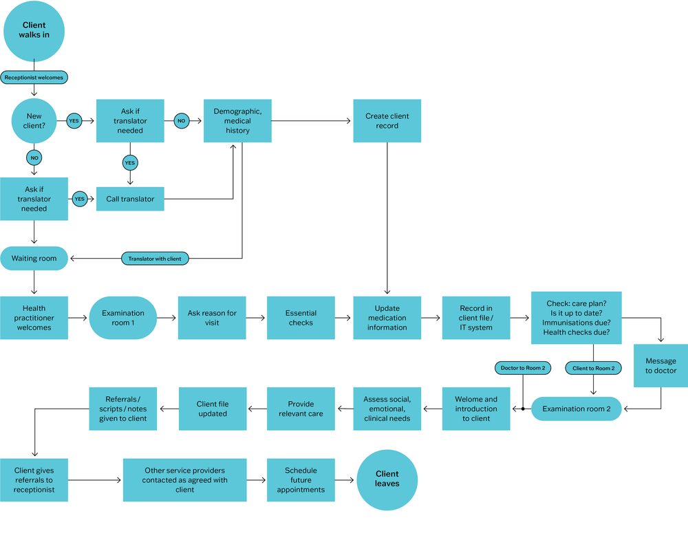
Figure 5.1 Example of client flow through a PHC centre.
The process of collectively developing a flowchart (for example, using sticky notes and discussing scenarios) can provide insight into how clients experience care and can also support teamwork. Input from staff in different roles and from clients is more likely to produce a realistic flowchart and support client-centred changes in care processes.36
The flowchart may reveal that a process does not operate the way staff or management think it does. Arriving at a common understanding helps the group to identify where there may be opportunities to improve care systems, and what needs to change.
Checklists
For CQI purposes, a checklist is usually a time-ordered list of process activities, often developed from a flowchart. Checklists are frequently used in routine care to support the delivery of comprehensive care routines. Each listed process activity or task is checked off by a team member when it is complete, making it easier to track and coordinate care processes between different practitioners and to see when a task has been missed. Examples in PHC are checklists of care items that need to be completed as part of an antenatal check, a well-baby check, and triage checklists used for determining the degree of urgency of wounds or illnesses when a client presents at the health centre.
Checklists can help teams to implement care routines in line with best-practice guidelines. They specify each task that needs to be completed, promote communication within and between teams in the same PHC setting, and reinforce the importance of everyone’s role in providing care. Use of checklists can reduce potential for errors and potentially lead to better care experiences and outcomes for clients.
Where records are kept of completed care for clients and then collated and analysed for CQI purposes, checklists can help teams to identify persisting gaps in routine care and to see whether changes made as part of a CQI program have improved workflow and team coordination.
Cause-and-effect (Ishikawa or fishbone) diagrams
A cause-and-effect diagram, also called an Ishikawa or fishbone diagram, is a simple graphic tool used to explore and display the possible causes of variation in quality of care, or a quality problem. It was first devised in the 1960s by Kaoru Ishikawa, a Japanese quality management pioneer.
A cause-and-effect diagram is used for these purposes:
- helping teams understand that there are many causes that contribute to an effect
- graphically displaying the relationship of the causes to the effect and to each other
- identifying the main factors that are contributing to gaps in care
- identifying priority areas for improvement.37
The primary axis or “spine” of a cause-and-effect diagram is an arrow leading to the effect – the variation in care or the quality problem to be addressed. The problem is written on the right-hand side of the diagram, representing the head of the fish. After a team has brainstormed the possible causes for the variation or problem, the facilitator helps the group to sort ideas into categories of contributing causes. These categories form the main ribs of the fish, which branch off the central spine. Commonly used categories to clarify quality problems in health care include client, provider, policies and procedures, physical environment/equipment, system and organisational culture.38 Figure 5.2 is a simple cause-and-effect diagram exploring possible causes for low rates of foot screening among clients with diabetes.39
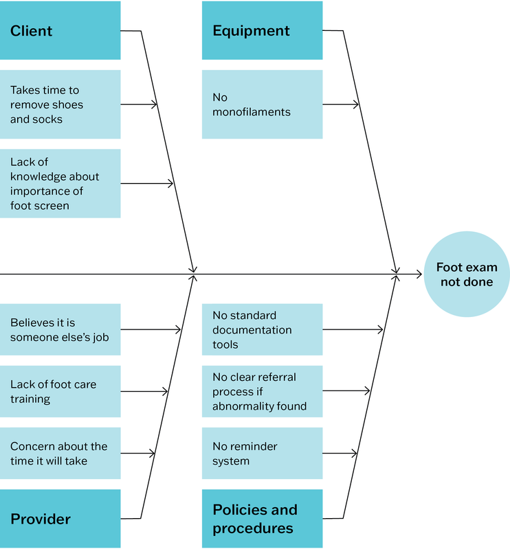
Figure 5.2 Example of a cause-and-effect diagram showing why clients with diabetes may not be receiving important items of care, namely foot examinations. Source: Halperin, Gilmour et al. 2019.
Another level of analysis could be added to this diagram, asking “why does this happen?” for each identified cause. This would help to establish the root causes or “drivers” of a problem. This diagram could also be expanded to include further detail about steps in the care process or protocol (for example, client recall) and possible barriers to completing each step to a high-quality standard (for example, an outdated contact list is a possible barrier to client recall).
The process of developing the cause-and-effect diagram allows everyone in the PHC team to be involved.
While this simple tool has limitations for illustrating and understanding the complex interactions within PHC systems, the process of developing the cause-and-effect diagram allows everyone in the PHC team to be involved. It promotes the use of systems thinking before planning change. Once a diagram is completed, the team uses focus questions to make sense of the information. For example, are there causes identified for each rib on the fish? What do gaps tell us about care delivery systems and how we view them? Which causes are or are not supported by evidence? Which causes have most effect on clients? Other CQI tools may be used to answer some of these questions and to focus improvement efforts, such as Pareto diagrams (described below).
Driver diagrams
A driver diagram, or “action effect diagram”,40 is a visual tool for identifying opportunities to improve care systems and processes. It “visually represents a shared theory of how things might be better, building upon knowledge gleaned from research, observation and experience”.41 By setting out causal pathways between an improvement aim and the primary and secondary “drivers” for achieving the aim, a driver diagram can be used for these two purposes:
- identify causes that underly variation in care
- systematically plan and test an improvement initiative to address the causes through tailored interventions.
A driver diagram is intended to be a living document that is updated as the PHC team builds and tests theories of improvement using, for example, plan-do-study-act cycles.42
A driver diagram is intended to be a living document that is updated as the PHC team builds and tests theories of improvement.
A driver diagram usually includes the following columns:
- aim – the agreed improvement aim, or what you are trying to achieve. The aim should be high-level but specific enough to guide and evaluate an improvement initiative. For example, “Improve delivery of care to address identified gaps in chronic illness care”.
- primary drivers – the main contributing causes of variation in care. These are the system components that you need to influence, to achieve the aim. For example, if your aim is “Improve delivery of care to address identified gaps in chronic illness care”, one main cause of variation (a primary driver) may be the “availability and use of clinical information systems and decision support tools”.
- secondary drivers – the factors or causes that contribute to the primary drivers. Several secondary drivers are likely to contribute to each primary driver (drawn using “relationship arrows”). For example, if a primary driver is “availability and use of clinical information systems and decision support tools”, secondary drivers may include “training of staff in effective use of clinical information systems” and “functionality and user-friendliness of clinical information systems”.
- change ideas/interventions – evidence-based change concepts or interventions to address the secondary drivers: that is, what you are going to do and how you are going to do it. For example, to improve “functionality and user-friendliness of clinical information systems”, a PHC service would implement a range of strategies, such as: “ensure the information system is up-to-date, and client recall and reminder lists are maintained” and “encourage and support visiting specialists to enter information about clients’ care into the local clinical information system”.43
Each change idea should contribute to at least one secondary driver. Teams may develop SMART goals and action plans (see Chapter 6) to implement interventions, which are often tested and tailored using plan-do-study-act cycles. Some driver diagrams prioritise change ideas. This is done by determining whether the change is likely to have a high or low impact on the aim, and whether it will be easy or difficult to implement.44 Addressing all of the identified secondary drivers should be sufficient to achieve the improvement aim.
Reading a driver diagram from left to right answers the question “What changes can we make that will result in an improvement?” Reading the diagram from right to left answers the question, “What are we trying to accomplish through these interventions?”
Developing a driver diagram can be a way of encouraging people in different roles to agree on some common goals and priorities. It supports systems thinking by encouraging PHC teams to explore the many factors that affect quality of care and how they are connected. The process helps to identify key leverage points in the system, and how activities and changes link to system components. These insights are helpful for measuring and monitoring improvement. A driver diagram can also be extended to develop a detailed program theory that includes aims, contributing factors, interventions, implementation activities and how the effectiveness of planned interventions will be measured.45
Figure 5.3 shows part of a driver diagram we developed following a wide-scale stakeholder survey about ways to improve the delivery of chronic illness care. Our study sought to identify drivers and change ideas at different levels of the health system. One of five primary drivers identified by survey respondents was “community capacity, engagement and mobilisation for health”.46
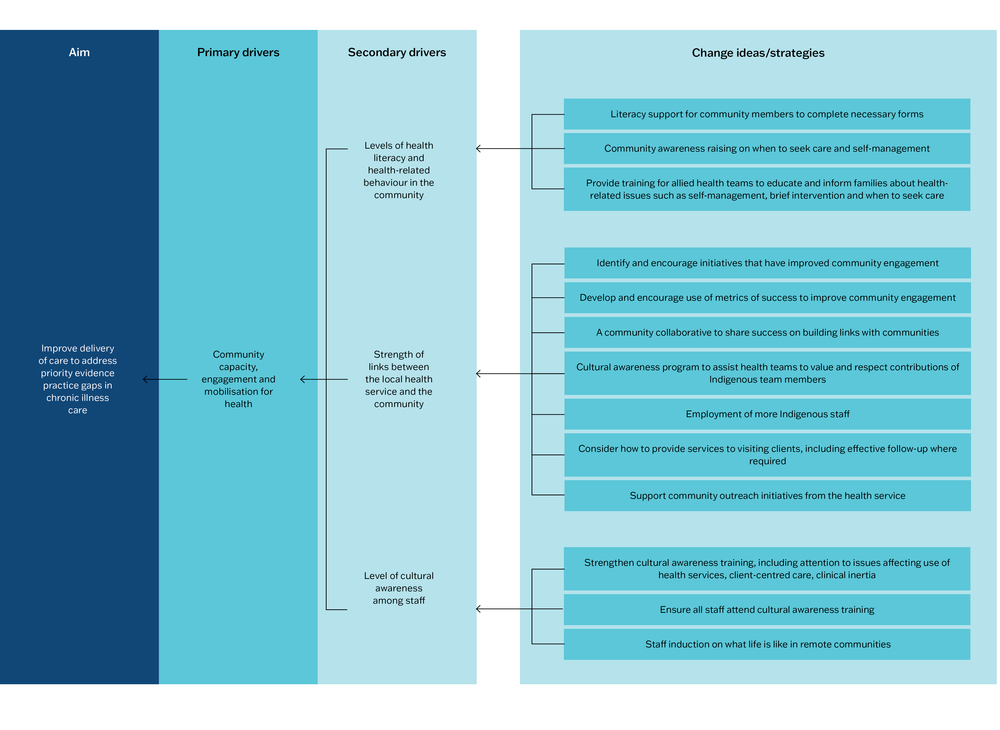
Figure 5.3 Example elements from a driver diagram. Source: Adapted with permission from Bailie, Laycock et al. 2016.
A simple driver diagram template can be downloaded from the Institute for Healthcare Improvement website. Access the Quality Improvement Essentials Toolkit.47
Pareto diagrams
Pareto diagrams are a data-analysis tool for identifying what matters most for improving the quality of care. It is useful for understanding variation (which is explained in Chapter 6). Named after a 17th-century Italian economist, Pareto analysis is based on the principle that 80 per cent of consequences (for example, gaps in best-practice care) come from just 20 per cent of causes. Identifying these “vital few” causes enables PHC teams to focus improvement efforts for maximum impact.
A Pareto diagram is used for identifying what matters most for improving the quality of care.
A Pareto diagram is a frequency chart with the columns arranged from the longest (most frequently observed or recorded items) on the left of the horizontal (x) axis to the shortest (least frequent items) on the right. For example, the items might be errors or gaps in care identified in a clinical audit, causes of system problems identified by staff, or results of a client survey. The vertical (y) axis shows the number of times the item or event occurred. A cumulative percentage line is then drawn showing the added contribution of each item (with the cumulative percentage scale usually recorded on the right-hand side of the diagram). A horizontal line is drawn at the 80-per-cent mark to intersect the cumulative percentage line. The items to the left of where these lines intersect are the “vital few” factors that warrant the most attention. In principle, addressing these items will create the most improvement in quality of care.
Figure 5.4 charts the results of a survey to find out why clients did not attend their appointments. In our example, the reason given most frequently was lack of transport to get to the PHC service, followed by forgetting the appointment. The least reported reasons were being unable to get time off work or being away. For the Pareto analysis, a cumulative percentage line was drawn by adding on the number of clients who gave each reason, starting with the largest group. A horizontal line was then drawn to intersect the line at the 80-per-cent mark. Four “vital few” reasons were identified. The analysis suggested that focusing on transport needs, and systems for appointment scheduling and reminders would significantly improve attendance. A change in clinic opening hours may also warrant attention.
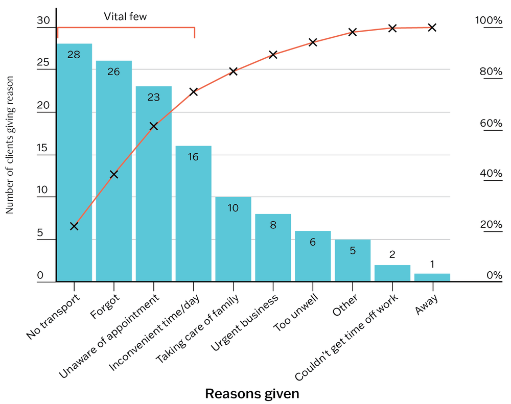
Figure 5.4 Pareto diagram example: reasons clients gave for not attending appointments.
Pareto analysis can be useful for building team consensus to prioritise improvement action. Pareto analysis can also be applied to data at scale to inform policy directions and strategic planning to improve care. We used Pareto analysis to identify the “vital few” barriers to wide-scale system improvement in PHC, following investigation of stakeholders’ views on system barriers to improving PHC. Our example of applied Pareto analysis is described in Chapter 20.
Run charts
A run chart is a simple tool for observing and understanding variation in quality of care over time. Data about process performance are gathered and displayed over time, enabling teams to observe patterns in the data. This may help to relate variation to changes in systems, care processes or the health service environment. Run charts can also be used to monitor changes in quality of care resulting from an improvement program, and whether improvements are sustained.
While conventionally used in healthcare settings with high client and staff numbers, such as hospitals, run charts can be useful for providing information about care processes in PHC settings. Examples might include the charting of how long clients wait to see a clinician or charting the percentage of clients who receive an examination recommended as part of best-practice care. When a planned change results in improvement (for example, a higher percentage of clients received the recommended examination), we would expect the median line of the run chart to shift.
Notes and arrows can be added to a run chart to show where change strategies have been tested (for example, using plan-do-study-act cycles), or to explain shifts or trends. Adding this information can help the team to understand patterns in the data and to plan change strategies. If an upward or downward “run” on a chart (a trend of 5 or more points) occurs without a deliberate change being made (for example, if average client waiting time continued to increase each week, or more examinations were missed), this would indicate a need to investigate and attend to the possible causes. By graphically displaying how well (or poorly) a process is working, a run chart may help the team to develop improvement aims, see the effect of changes, see whether changes are truly improvements and inform the refinement of ongoing improvement work.
A run chart may help the team see the effect of changes and whether changes are truly improvements.
Figure 5.5 charts the average time clients spent in the waiting room of a PHC practice. Long wait times can be a barrier to clients accessing PHC. In this hypothetical example, wait times were recorded and averaged each week for 10 weeks by the health centre receptionists. A run chart was developed, displaying a median wait time of 70 minutes. In response, a new appointment system was trialled. Recording and charting wait times for a further 10 weeks showed that the new appointment system led to greatly reduced wait times (median 25 minutes) and should be continued and refined.
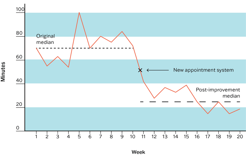
Figure 5.5 Run chart example: average client time in waiting room.
A guide on using run charts in PHC has been developed by the United Kingdom Royal College of General Practitioners.48 More advanced charting methods are available for teams seeking statistical rigour or reassurances that improvement is being sustained or the process is still in flux; your team could consider using a statistical process control chart for this purpose. The Institute for Healthcare Improvement’s “Quality Improvement Essentials Toolkit” has guidance on using run charts and control charts.49
Use of continuous quality improvement tools
CQI tools should not be used in isolation; their use is only part of the CQI process or cycle. Different tools are used during different phases of the CQI cycle, as shown in Figure II.1 in the Part II Summary.
A CQI tool is typically used in these situations:
- in conjunction with other CQI tools – for example, a systems assessment tool may be used in conjunction with a clinical audit tool to assess the quality of diabetes care, with interpretation aided by information collected through a health centre and community survey
- as part of a CQI technique – for example, an audit tool is often used as part of “audit and feedback”, a flowchart may be used as part of systems thinking
- to support a methodological approach, such as Lean or Six Sigma (see below).
In some cases, a PHC network or large health service may require the use of standardised tools as part of a system-wide approach to CQI and data management. This approach is useful for comparing the performance of your service or practice with others. It can be rewarding to know that your systems are working at a particularly high standard for your clients, and reassuring to know that other teams are experiencing a similar quality challenge. Importantly, such insights can start conversations between teams about what has worked well or not so well to improve care and can lead to the establishment of CQI collaboratives and other quality forums.
A continuous quality improvement tool is used as part of a continuous quality improvement process or cycle
Methodological approaches
Lean and Six Sigma methods
CQI tools may be used as part of a methodological approach to CQI. Lean and Six Sigma CQI methods originated in manufacturing industries in the 1980s and have become popular improvement approaches in health care. Lean focuses on eliminating waste in care processes through an ongoing system of improvement that adds value for clients (for example, by reducing wait times to see clinicians). It tends to be used to improve processes and workflows in large healthcare settings rather than for small changes to a care process or system.50 Six Sigma is a data-driven system combining statistical analysis with quality management methods. It focuses on variation and is used to reduce client safety incidents (for example, incorrect diagnosis or treatment) and to remove defects from the processes involved in delivering care (for example, failing to follow up abnormal screening results).
Lean and Six Sigma are often used together in healthcare settings in a “Lean Six Sigma” approach. This approach uses five steps to improve care processes, as follows:
- define – clients, client needs and values, the process being measured, team objectives
- measure – identify data and metrics to measure improvement efforts
- analyse – collect and analyse data using proven techniques and tools (for example, clinical auditing, client surveys, systems assessment tools and other tools described in this chapter such as flowcharts, Pareto diagrams, cause-and-effect diagrams)
- improve – implement modifications to improve the process
- control – monitor performance to maintain improvement.
Lean Six Sigma has been found to be effective for improving care processes51 but, to date, there is little reported use in PHC settings. Most publications in English describe studies conducted in the United States, mainly in hospital and specialist settings with the CQI objective of reducing demands on time (for example, through better client flow or shorter hospital stays), cost (for example, avoiding unnecessary procedures) or errors (for example, reducing medication errors, risk of infection).52 There is need to investigate the use and effect of Lean and Six Sigma in PHC settings and in low- and middle-income countries, and to study the sustainability in implementing improvements based on these methods.53
Lean Six Sigma adopts widely used CQI tools and techniques (for example, clinical auditing, Pareto analysis). Use of these tools and techniques in your CQI program does not mean that you are using the Lean Six Sigma method. But your team may decide to use elements of Lean and Six Sigma approaches, such as removing a step that is perceived as wasteful in a client consultation process, to provide more time for other steps.
Box 5.2 Questions to ask when considering the use of a CQI method
- Is there evidence that the CQI method is effective for improving PHC?
- Does use of the method require specialised training and additional resources?
If so, are these available? - Is the method suited to our PHC context?
- Will the method involve the whole team in learning and improvement?
- Does the method offer a systematic approach for implementing and sustaining improvement?
Summary
This chapter has presented some practical tools for improving the quality of PHC. They include tools for assessing care structures, conducting clinical audits, assessing systems, measuring client experiences of PHC, and for assessing health promotion. While developed for use in Australian PHC, they can be adapted for other settings or updated to reflect new evidence, treatments or technologies. We have also described some CQI tools for visualising PHC systems and processes. These tools can be used when engaging teams in collecting and analysing data, understanding variation in quality and planning improvement. CQI tools need to be selected based on the improvement purpose, the PHC setting and team, and available data.
There is much potential for the development of further CQI tools for use in PHC, and of new ways to visualise and assess PHC systems and processes. Examples are tools that integrate different knowledge systems (for example, Western and Indigenous knowledges), tools and processes that reflect the way specific groups conceptualise health and quality of care, and CQI tools that respond to the health and wellbeing challenges related to climate change. CQI tools, like PHC, should be responsive to the needs and values of populations and settings and should aim to advance healthcare equity.
In the next chapter, we describe CQI cycles and discuss the presentation and analysis of CQI data. Useful websites for downloading CQI tools and templates are listed at the end of Part II.
References
Bailie, J., A. Laycock, V. Matthews and R. Bailie (2016). System-level action required for wide-scale improvement in quality of primary health care: synthesis of feedback from an interactive process to promote dissemination and use of aggregated quality of care data. Frontiers in Public Health 4: 86. DOI: 10.3389/fpubh.2016.00086.
Bennett, B. and L. Provost (2015). What’s your theory? Driver diagram serves as tool for building and testing theories for improvement. Quality Progress July: 36–43.
Bonomi, A.E., E.H. Wagner, R.E. Glasgow and M. VonKorff (2002). Assessment of chronic illness care (ACIC): a practical tool to measure quality improvement. Health Services Research 37(3): 791–820. DOI:10.1111/1475-6773.00049.
Brimblecombe, J. (2014). Good food planning tool. Menzies School of Health Research. Darwin: Menzies School of Health Research. https://www.menzies.edu.au/page/Resources/Good_food_planning_tool/.
Brimblecombe, J., R. Bailie, C. van den Boogaard, B. Wood, S. Liberato, M. Ferguson et al. (2017). Feasibility of a novel participatory multi-sector continuous improvement approach to enhance food security in remote Indigenous Australian communities. SSM – Population Health 3(C): 566–76. DOI: 10.1016/j.ssmph.2017.06.002.
Brimblecombe, J., C. van den Boogaard, B. Wood, S.C. Liberato, J. Brown, A. Barnes et al. (2015). Development of the good food planning tool: a food system approach to food security in indigenous Australian remote communities. Health Place 34: 54–62. DOI: 10.1016/j.healthplace.2015.03.006.
Chakraborty, A. E. Walke, R. Bainbridge, R. Bailie, V. Matthews, S. Larkins et al. (2023). VOICE – validating outcomes by including consumer experience: a study protocol to develop a patient reported experience measure for Aboriginal and Torres Strait Islander peoples accessing primary health care. International Journal of Environmental Research and Public Health 20(357). DOI: 10.3390/ijerph20010357.
Clinical Excellence Commission (n.d.). Quality Improvement Tools: driver diagrams. https://www.cec.health.nsw.gov.au/Quality-Improvement-Academy/quality-improvement-tools.
CRE-STRIDE (n.d.). http://cre-stride.org.
Cunningham, F., S. Ferguson-Hill, V. Matthews and R. Bailie (2016). Leveraging quality improvement through use of the systems assessment tool in Indigenous primary health care services: a mixed methods study. BMC Health Services Research 16(1): 583. DOI: 10.1186/s12913-016-1810-y.
Doyle, C., L. Lennox and D. Bell (2013). A systematic review of evidence on the links between patient experience and clinical safety and effectiveness. BMJ Open 3(1): e001570. DOI: 10.1136/bmjopen-2012-001570.
Grazia, A., L. Laura, B. James, E. Liz and R. Julie (2021). Process mapping in healthcare: a systematic review. BMC Health Services Research. DOI: 10.21203/rs.3.rs-80631/v1.
Halperin, I., J. Gilmour, P. Segal, L. Sutton, R. Wong, L. Caplan et al. (2019). Determining root causes and designing change ideas in a quality improvement project. Canadian Journal of Diabetes 43(4): 241–8. DOI: 10.1016/j.jcjd.2019.03.001.
Institute for Healthcare Improvement (2017). Quality improvement essentials toolkit. http://www.ihi.org/resources/tools/quality-improvement-essentials-toolkit.
Institute of Medicine (2001). Crossing the quality chasm: a new health system for the 21st century. Washington, DC: National Academies Press. DOI: 10.17226/10027.
Larson, E., J. Sharma, M. Bohren and Ö. Tunçalp (2019). When the patient is the expert: measuring patient experience and satisfaction with care. Bulletin of the World Health Organization 97(8): 563–9. DOI: 10.2471/BLT.18.225201.
Menzies School of Health Research and One21seventy (2015). Consumer’s perspective of the quality of care tool. https://www.menzies.edu.au/page/Resources/Consumer_s_Perspective_of_Quality_of_Care_Tool/.
Menzies School of Health Research & One21seventy (2014). Health centre and community survey. Darwin: Menzies School of Health Research.
Menzies School of Health Research and One21seventy (2013). Vascular and metabolic syndrome management clinical audit tool. https://www.menzies.edu.au/page/Resources/Vascular_and_Metabolic_Syndrome_Management/.
Menzies School of Health Research and One21seventy (2012). Systems assessment tool – all client groups. Darwin: Menzies School of Health Research.
Naqshbandi Hayward, M., J. Paquette-Warren, S. Harris and on behalf of the Forge Ahead Program Team (2016). Developing community-driven quality improvement initiatives to enhance chronic disease care in Indigenous communities in Canada: the FORGE AHEAD program protocol. Health Research Policy and Systems 14(1): 55. DOI: 10.1186/s12961-016-0127-y.
National Learning Consortium (2014). Continuous quality improvement (CQI) strategies to optimize your practice: primer. Washington, DC: Health Information Technology Research Center.
Niñerola, A., M. Sánchez-Rebull and A. Hernández-Lara (2020). Quality improvement in healthcare: Six Sigma systematic review. Health Policy 124(4): 438–45. DOI: 10.1016/j.healthpol.2020.01.002.
Northern Territory Aboriginal Health Forum (2021). Tobacco control guide. Darwin: Northern Territory Government & Aboriginal Medical Services Alliance NT (AMSANT).
O’Donoghue, L., N. Percival, A. Laycock, J. McCalman, K. Tsey, C. Armit et al. (2014). Evaluating Aboriginal and Torres Strait Islander health promotion activities using audit and feedback. Australian Journal of Primary Health 20(4): 339–44. DOI: http://dx.doi.org/10.1071/PY14048.
One21seventy and Heart Foundation (2016). Tobacco control audit tool. Menzies School of Health Research. Darwin: Menzies School of Health Research.
One21seventy and Menzies School of Health Research (2012). Health promotion systems assessment tool. Darwin: Menzies School of Health Research.
Peimbert-García, R. (2019). Analysis and evaluation of reviews on Lean and Six Sigma in health care. Quality Management in Health Care 28(4): 229–36. DOI: 10.1097/qmh.0000000000000226.
Peiris, D., A. Brown, M. Howard, B.A. Rickards, A. Tonkin, I. Ring et al. (2012). Building better systems of care for Aboriginal and Torres Strait Islander people: findings from the Kanyini health systems assessment. BMC Health Services Research 12(1): 369. DOI: 10.1186/1472-6963-12-369.
Percival, N., L. O’Donoghue, V. Lin, K. Tsey and R.S. Bailie (2016). Improving health promotion using quality improvement techniques in Australian Indigenous primary health care. Frontiers in Public Health 4: 53. DOI: 10.3389/fpubh.2016.00053.
Point of Care Foundation (n.d.). Patient and family-centred care toolkit. https://www.pointofcarefoundation.org.uk/resource/patient-family-centred-care-toolkit/.
Puszka, S., T. Nagel, V. Matthews, D. Mosca, R. Piovesan, A. Nori et al. (2015). Monitoring and assessing the quality of care for youth: developing an audit tool using an expert consensus approach. International Journal of Mental Health Systems 9(28): 1–12. DOI: 10.1186/s13033-015-0019-5.
Reed, J., C. McNicholas, T. Woodcock, L. Issen and D. Bell (2014). Designing quality improvement initiatives: the action effect method, a structured approach to identifying and articulating programme theory. BMJ Quality and Safety 23(12): 1040–8. DOI: 10.1136/bmjqs-2014-003103.
Sollecito, W. and J. Johnson (2019). McLaughlin and Kaluzny’s continuous quality improvement in health care. Burlington, MA: Jones & Bartlett Learning.
Thomas, D. (2020). Tobacco control research evidence to monitor and support a comprehensive approach to tobacco control in NT health services. Darwin: Northern Territory Aboriginal Health Forum. http://www.amsant.org.au/tobacco-control/.
Ward, J., S. McGregor, R. Guy, A. Rumbold, L. Garton, B. Silver et al. (2013). STI in remote communities: improved and enhanced primary health care (STRIVE) study protocol: a cluster randomised controlled trial comparing “usual practice” STI care to enhanced care in remote primary health care services in Australia. BMC Infectious Diseases 13(1): 425. DOI: 10.1186/1471-2334-13-425.
World Health Organization (2002). Innovative care for chronic conditions: building blocks for action: global report. Geneva: World Health Organization.
1 Menzies School of Health Research and One21seventy 2014.
2 For an example of a diabetes audit tool, see Menzies School of Health Research and One21seventy 2013.
3 Puszka, Nagel et al. 2015. Access the Youth Health Clinical Audit Tool online.
5 Menzies School of Health Research and One21seventy 2012.
6 Cunningham, Ferguson-Hill et al. 2016.
7 Bonomi, Wagner et al. 2002.
8 World Health Organization 2002.
9 Percival, O’Donoghue et al. 2016.
10 Peiris, Brown et al. 2012.
11 Ward, McGregor et al. 2013.
12 Naqshbandi Hayward, Paquette-Warren et al. 2016.
14 Cunningham, Ferguson-Hill et al. 2016, 7.
15 Cunningham, Ferguson-Hill et al. 2016, 7.
16 Institute of Medicine 2001.
17 Doyle, Lennox and Bell 2013.
18 Larson, Sharma et al. 2019.
19 Menzies School of Health Research and One21seventy 2015.
21 Chakraborty, Walke et al. 2023.
22 CRE-STRIDE n.d.
23 Percival, O’Donoghue et al. 2016.
24 O’Donoghue, Percival et al. 2014.
26 One21seventy and Menzies School of Health Research 2012.
28 One21seventy and Heart Foundation 2016.
30 Northern Territory Aboriginal Health Forum 2021; Thomas 2020. Download from http://amsant.org.au/tobacco-control/.
31 Brimblecombe 2014.
32 Brimblecombe, van den Boogaard et al. 2015.
34 Brimblecombe, Bailie et al. 2017.
35 Point of Care Foundation n.d.
36 Grazia, Laura et al. 2021.
37 Institute for Healthcare Improvement 2017.
38 Halperin, Gilmour et al. 2019.
39 Halperin, Gilmour et al. 2019.
40 Reed, McNicholas et al. 2014.
41 Bennett and Provost 2015, 36.
42 Bennett and Provost 2015.
43 Bailie, Laycock et al. 2016.
44 Clinical Excellence Commission n.d.
45 Reed, McNicholas et al. 2014.
46 Bailie, Laycock et al. 2016.
47 Institute for Healthcare Improvement 2017. Download from http://www.ihi.org/resources/tools/quality-improvement-essentials-toolkit.
48 See https://gmpcb.org.uk/general-practice/gp-excellence/resources/rcgp-quick-guide-run-charts/.
49 Institute for Healthcare Improvement n.d.b.
50 National Learning Consortium 2014.
51 Sollecito and Johnson 2019.
52 Niñerola, Sánchez-Rebull 2020.
53 Peimbert-García 2019.