6
Using CQI cycles, and understanding and presenting data
Continuous quality improvement (CQI) cycles are data-driven ongoing cycles of learning and improvement. The cycles enable participants to use data to identify quality improvement priorities, set improvement goals, identify causes of poor system quality, plan and implement change, and find out whether a change led to improvement. Our approach starts with the assumption that there is always scope for improvement in some aspect of care. But how should local teams identify priority areas for improvement? Knowledge of developments in best practice among clinical leaders, of concerns about delivery of certain aspects of care, of predominant health issues or “burden of disease” in the health service population, of priority health concerns for local communities, and of the findings of previous clinical audits should all contribute to identifying important areas for improvement (for example, in chronic illness care or in some specific aspect of care). Sometimes the focus of CQI cycles is determined at a higher system level – for example, based on key performance indicators across a group of PHC services or practices. In all cases it is imperative that the local health service teams understand the basis or rationale for selection of the priority area for improvement, as their work and engagement will be integral to achieving the desired goals.
The next step is to identify the most appropriate resources on best-practice care relevant to the identified priority area for improvement (for example, care as recommended in the best-practice guidelines for diabetes care for the service setting). From this starting point, PHC teams select an appropriate audit tool (or adapt an existing tool or develop a new tool if necessary) and conduct an audit to determine which elements of care are being delivered relatively well or not so well. Those that are being delivered less well then become the priorities for improvement efforts. The CQI cycle described in this chapter in based on this approach.
It is essential that the data used for CQI are fit for purpose and presented in ways that help PHC teams and other healthcare stakeholders to identify and understand variation in quality of care. This chapter introduces a CQI cycle developed for PHC settings. Each phase of the cycle is explained, using examples to illustrate key concepts and processes.
The CQI cycle
As discussed in Part I, PHC is holistic care that is complex in its scope and the way it is delivered. PHC providers are diverse, widely dispersed and, while relatively independent in their practice, work closely with other providers. In a PHC setting, a CQI initiative is likely to involve diverse health professionals, clients, community groups and people who work in sectors that influence the social, cultural and environmental determinants of health. It may involve an entire PHC centre or practice team, and other service providers, in using CQI cycles to implement system change and improve the quality of care.
Plan-do-study-act (or PDSA) cycles are commonly used in CQI to achieve a specific goal. Through applied CQI research (described in Part III), our research group adapted the conventional PDSA cycle for use at the PHC centre or program level.1 The resulting CQI cycle can be implemented over an extended timeframe (for example, over an annual audit and systems assessment cycle) compared with rapid PDSA cycles (which are discussed later in this chapter in the context of implementing improvement strategies).
As mentioned in the chapter introduction, the adapted CQI cycle is used by PHC teams to identify what is working well and not so well to deliver care or PHC programs, to collectively identify priorities for improvement and to plan and implement targeted improvement strategies. Four phases are continuously repeated to achieve, sustain and build on quality improvement (Figure 6.1):
- data collection
- data analysis
- participatory interpretation, goal setting and action planning
- implementation.
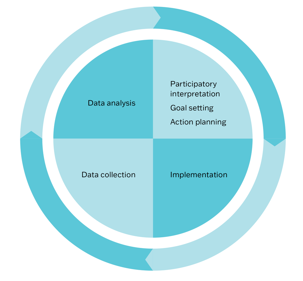
Figure 6.1 Figure 6.1 The CQI cycle in PHC. Source: Brands, Griffin et al. 2010; used with permission of Menzies School of Health Research.
Data collection
Measuring quality and improvement
The purpose of measuring quality and improvement is to support the team to identify improvement priorities and to set and achieve their quality improvement goals. Planned systematic measurement, through data collection, provides the information needed to answer the question, “How will we know that a change is an improvement?” (see Chapters 2 and 4), and to know whether an improvement goal is met. Measurement should be continuous, reflecting the nature of CQI cycles. There are various purposes and opportunities for data collection:
- An improvement initiative is often based on data collected as part of the routine operations of the PHC practice or service (for example, to meet reporting requirements). Even when this is the case, the team is likely to need detailed baseline data at the start of an improvement initiative (for example, clinical audit data), to determine where system changes are needed and to serve as a baseline or benchmark for measuring improvement.
- As improvement strategies are implemented, data are collected to measure changes (planned and unintended), and to show whether the team is on track to achieve the goal (for example, by using short plan-do-study-act cycles). Various types of data are collected and analysed to build a picture of what is changing and whether the changes are improvements. The learning gained is used to refine improvement strategies, or adjust goals and action plans, or both.
- Repeating the collection of data after a specific interval, using the same methods (for example, an annual clinical audit) shows what has been accomplished during the CQI cycle and identifies persistent gaps in care quality. This information is used for maintaining changes and for setting further goals and strategies for improvement.
What should be included in a plan for measuring improvement?
A plan for measuring improvement should specify:
- what data will be collected
- what methods will be used
- when and how often data will be collected
- who will be responsible for each element.
Measuring improvement answers the question, “How will we know that a change is an improvement?”
Aligning measures with improvement goals
Measures of improvement should align with the improvement goal your team has set (what will be achieved and by when: see “Goal setting” in this chapter) and relate directly to the factors you are aiming to change. Because goals focus on PHC system improvement, you are likely to need indicators that relate to PHC structures, processes and outcomes (rather than outcomes alone).
For example, a goal might be “Within 12 months, increase child immunisation rates by 50 per cent”. These are possible measures of improvement (indicators) for this goal:
- child immunisation rates assessed by baseline and follow up audits
- family “knowledge about immunisation” surveys before and after an education campaign
- level of parent or carer engagement in the immunisation program tracked monthly
- staff satisfaction and experiences with the immunisation program continuously monitored
- proportion of clinical staff trained to provide immunisations at start and after 12 months
- number of completed immunisations at 6 and 9 months into the program.
Monitoring staff satisfaction and experiences is important for noting how changes made are affecting team interactions, workloads and other aspects of day-to-day care delivery. It aligns with the core value of including CQI as a routine agenda item in team or staff meetings.
Ensure that resources are available for measuring improvement, and that the measures, the scale of data collection and timeline are manageable for the team. The tools described in Chapter 5 can be used for measuring improvement over time.
Example: measuring improvement in child immunisation
Optimal immunisation program service delivery and childhood vaccine coverage remains an ongoing challenge in South Africa. Interventions aiming to improve immunisation service delivery in children under 24 months were co-designed with stakeholders in three clinics in Khayelitsha, Western Cape Province, South Africa. The prioritised interventions were implemented over a timeframe of 4–6 months and included weekly community radio sessions about immunisation; daily nurse-led education sessions at each clinic; service provider checklists to prompt delivery of all components of immunisation sessions; parent checklists to gather feedback and raise expectations about service quality; and health promotion materials (posters/postcards).
These indicators were used to measure improvement:
- service delivery outcomes for each clinic, including the number of vaccine doses delivered to children under 9 months per month
- parental engagement and knowledge, including changes in parents’ and guardians’ attitudes towards immunisation and interaction between parents or guardians and service providers
- parental satisfaction with immunisation services provided
- accessibility of services as reported by parents
- parents’ and service providers’ reported experience and outcomes, as a result of the changes.
Data collection methods included clinical audit, pre–post surveys, interviews and focus groups.2
Data analysis
Presenting data
In this section, we summarise graphs that are useful for presenting and analysing CQI data and provide examples of their use.
Bar graphs
A bar (or column) graph is used to visually compare categories of data or data values, or to track changes in values over time, or both. By visually quantifying data, bar charts can help teams to recognise and analyse anomalies, patterns or trends. The bars may be plotted horizontally or vertically. One axis of the graph shows the specific categories being compared, and the other axis represents a measured value, as a number or percentage.
Bar graphs are useful in CQI because they are simple to construct, easy to understand and versatile. For example, bar graphs can be used to visually quantify survey responses, clinical indicator and service delivery data, to compare data collected over consecutive audit cycles and to display demographic data. They can compare multiple indicators (Figure 6.2) or focus on a single item of care (Figure 6.3). Bars can be divided into parts that represent portions of a data category (Figure 6.3).
Figure 6.2 is a bar graph displaying data about delivery of a service. It shows the proportion of clients diagnosed with coronary heart disease who received specific items of care recommended in best practice care guidelines. By presenting audit data in a way that shows which items of care have been done well and less well (in this case by using two colours), the graph can help a team to identify priorities for improvement.
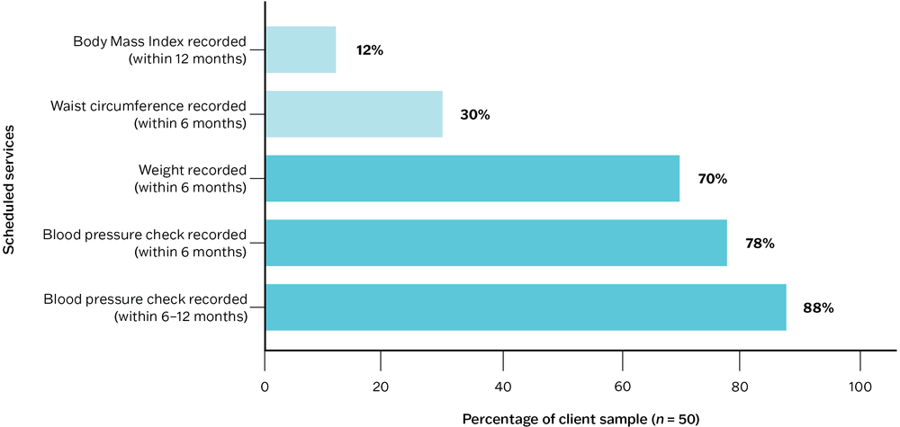
Figure 6.2 Bar graph example: proportion of clients with coronary heart disease by record of scheduled services.
Figure 6.3 is a “stacked” bar graph, in which the bars are divided to represent portions of a data category. Each bar represents all (100 per cent) of the audited client records for that client group and audit year. In this example, the bars represent percentages of clients by record of tobacco smoking status in the last 12 months. By presenting data in this way, staff can see a change in practice over time (that is, continuing improvement in inquiry and recording of smoking status) and its possible impact on data about the number and percentage of clients who smoke tobacco.
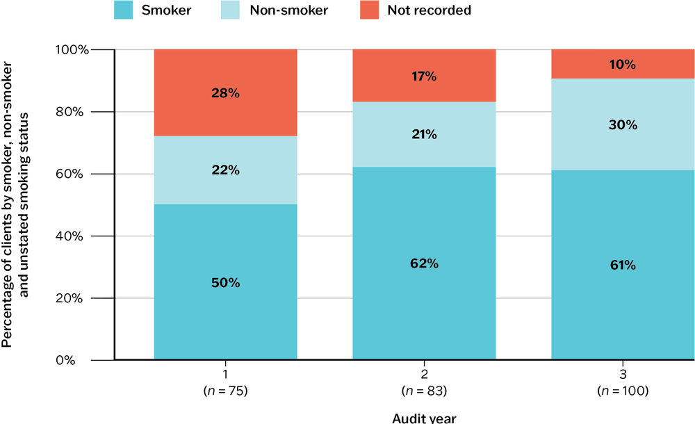
Figure 6.3 Stacked bar graph example: proportion of adult clients by recorded tobacco smoking status in the last 12 months and by audit cycle.
In Audit year 1, smoking status was not recorded in the health records of 28 per cent of adults in the client group. This dropped to 17 per cent in Audit year 2. By Audit year 3, only 10 per cent of clients, health records had no record of smoking status. This shows an improvement in practice over the three audit cycles. The percentage of smokers is consistent between Audit years 2 and 3 (61 per cent and 62 per cent respectively), suggesting that more than a third of clients for whom smoking status was not recorded in Audit year 2 were non-smokers.
Box 6.1 Best-practice design for bar graphs
- Use a zero-value baseline for meaningful comparison of data values.
- Use horizontal data labels to improve readability.
- Standard convention is to sort the bars from longest to shortest, unless there is a reason for ordering the category labels (for example, by audit years).
- Add value labels (numbers or percentages) where these are important.
See also “Pareto diagrams” in Chapter 5.
Box and whisker plots
A box and whisker plot displays variation in a set of data and is therefore useful for showing variation in PHC delivery.
Box and whisker plots show (Figure 6.4) these elements:
- the minimum and maximum values (ends of whiskers if no outliers)
- outliers that are values far away from most other values in the data set (or a distance that is greater than 1.5 times the length of the box)
- the range of service item delivery by dividing the dataset into quarters
- the box represents the middle 50 per cent of the dataset, and the line within the box represents the median (or middle value)
- the top whisker (and outliers if present) represents the top 25 per cent of the data
- the bottom whisker (and outliers if present) represents the bottom 25 per cent of the data
- the longer the box plot, the greater the range (or variation).
Figure 6.5 presents data from audits of PHC centre records about treatment and care for clients diagnosed with a mental illness. The box and whisker plots show mean health centre percentages for 269 clients attending at 17 Indigenous PHC centres in the three months prior to a clinical audit. The results show wide variation in service delivery. For example, psycho-health education of clients ranged from 0 to 100 per cent (the 25th to 75th centile is 15–80 per cent). Compare this with data for psycho-health education of family and/or carers: 75 per cent of data ranges between 0 and 38 per cent, suggesting a need for family and carer education programs in psycho-health.
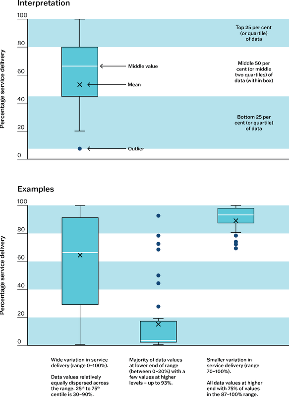
Figure 6.4 How to interpret box and whisker plots. Source: Matthews, Connors et al. 2015.
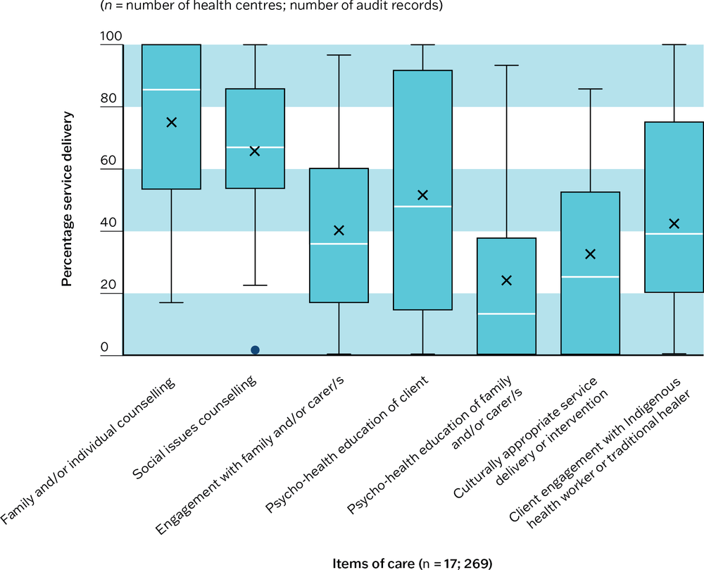
Figure 6.5 Box and whisker plot example: mean health centre percentage of mental health clients with a record of scheduled treatment and care in the last three months. Source: Matthews, Bailie et al. 2016.
Radar plots
A radar plot is designed to plot one or more series of quantitative values over multiple variables (three or more) on a two-dimensional plane. Sometimes called web, star or spider charts, radar plots are useful in CQI for these purposes:
- visually presenting a large amount of information in one graph
- comparing multiple variables (for example, of system performance) using a simple form
- integrating information about different quality concepts (for example, health outcomes, client satisfaction, cost)
- observing how the values change over time or between groups (for example, a group of health centres).
Radar plots have at least three axes, drawn from a central point. In most radar plots, the axes are equally distributed and drawn in the same way. Each axis represents a variable and is labelled. Values in a series are plotted on the axes and joined to form a shape. As each series is added (for example, the values for each year), variation in the size and in the shape of the plot shows changes or variation in care quality or systems.
Figure 6.6 presents a health centre’s systems assessment scores over three annual audit cycles. Five axes radiating from the centre show scores out of ten for the five main components of the system assessment (for example, information systems and decision support). Scores towards the middle indicate that parts of the system are less well developed and have greater potential for improvement. Scores towards the boundary indicate well-developed systems. In this example, increase in size of the “radar” shape shows overall improvement in the health centre’s systems over time. For examples of radar plots used in this way, see Woods et al, 2017.3
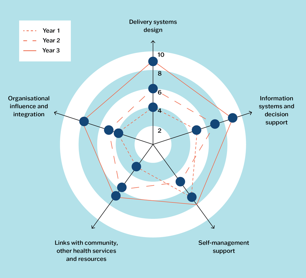
Figure 6.6 Radar plot example: a health centre’s systems assessment scores over three annual audit cycles.
Data tables and dashboards
While not classified as graphs, we include data tables and dashboards because they are commonly used to display data for CQI purposes.
Data tables are used to find values, compare values or communicate multiple units of measure in columns and rows format: for example, data about client numbers, attendance, demographics, clinical indicators or services delivered.
A data dashboard is a high-level summary of data, displayed on one page or computer screen, that helps the team or organisation to monitor performance and quickly identify opportunities for analysis and improvement. A data dashboard commonly includes graphs and data tables. For example, a diabetes dashboard might provide a snapshot of the number of clients with diabetes, numbers and percentages of clients who have received specific items of care within a specified timeframe, and data relating to important clinical indicators for diabetes management.
Box 6.2 General tips for presenting data
- Choose the appropriate type of graph, figure or table for presenting and understanding the data, and for your CQI purpose.
- Avoid detail that is not necessary for understanding the data (for example, repeated words/symbols, prominent grid lines and explanatory text on graphs).
- Avoid pie charts unless simple and representing only a few variables that add up to 100 per cent.
- Use colour with intention (for example, to highlight an important finding or changes over time).
- Avoid 3D effects and shading.
Online advice on data visualisation is readily available. We recommend the Evergreen Data website and textbooks for accessible advice on effective communication of data.4
This section has presented different ways to present data for analysis, but it is not necessary to have sophisticated data tools to produce useful reports for CQI. Your team’s CQI reports should aim to give the team and managers an accurate picture of what is happening at that point in time, and from one cycle to the next.
You do not need sophisticated data tools to produce useful reports for CQI.
Understanding variation in quality
We have made many references to variation in quality of care. Understanding and addressing variation is the focus of much CQI work. It was the starting point for quality improvement pioneers such as Shewhart and Deming, who sought to understand and reduce variation in the quality of manufactured goods. Variations in health care include differences in:
- the proportion of diabetic clients with poor blood glucose control
- rates of screening for certain conditions over time
- waiting time to access a service
- rates of referral to smoking cessation programs
- the number and characteristics of clients seeking social support services
- the proportion of men and women attending for health checks
- performance between health services.
These are all examples of variation in outcomes. Outcomes are affected by care processes, which in turn are affected by care structures (remember Donabedian’s theory?). To understand the underlying causes of variation in outcome, we look for variation in processes and structures that may explain them.
The quality improvement studies of our research network have consistently found wide variation in adherence to clinical best-practice guidelines between health services.5 They also show variation among different aspects of care, with relatively good delivery of some aspects, such as physical checks for clients with chronic illness, and poor delivery of others, such as follow-up of abnormal clinical or laboratory findings.6 These findings are evident in diabetes care,7 eye care,8 general preventive clinical care,9 and in cardiovascular risk assessment.10 They are consistent with CQI research findings in maternal care,11 child health,12 rheumatic heart disease13 and sexual health.14
To respond effectively to variation – whether it be variation in performance between health services, or variation in care processes or service delivery at the health centre level – it is necessary to identify the sources of variation and understand what is causing it.
Sources of variation
Variation in care quality is often the result of the way systems are structured and how processes are managed, such as how services are accessed and delivered, the composition of PHC teams, how care is coordinated, how client referrals are organised and how information is recorded in clients’ health records. Variation also has other, natural sources, such as differences in the symptoms and health conditions that clients present with, differences relating to clients’ age, gender and socio-economic circumstances, and differences in the skills and motivation of staff.
The variation found in the studies listed at the end of the previous section is largely explained by the way systems are structured and managed at the health service level15 and at the policy level.16 The variation is less likely to be caused by client characteristics. In addition, our CQI research has shown that PHC staff are highly motivated to improve the health of their clients,17 indicating that system factors around PHC staffing, rather than the characteristics of staff, affect variation in care quality.
Causes of variation
It is important to understand the distinction between common and special causes of variation. This understanding enables teams to make decisions about the most appropriate action for improvement.
Common cause variation is the predictable, random variation that occurs naturally in stable processes.18 It is the sum of many small variations from minor causes, which means that the variation cannot be traced back to a single root cause. Common cause variation can come from the way systems are structured and used, or from natural sources.
Example of common cause variation
A large PHC service used run charts to track wait times over 12 months for children referred to speech pathology services. Waiting times generally varied between 4 weeks and 5 months. Variation could be explained by a combination of factors. These included an ongoing nationwide shortage of speech pathologists, restricted places for new clients due to many children needing long-term therapy, the need to match the therapy needs of individual children to the specialised skills of individual speech pathologists, and parents’ availability to attend appointments.
Special cause variation is unpredictable deviation that results from unexpected occurrences. It is not an inherent part of a process or system,19 and can be traced back to a root cause. Like common cause variation, the source of special cause variation may be system based (for example, triggered by an unusual system error that resulted in a long delay in treatment for some clients) or naturally occurring (for example, the PHC practice records its first case of tuberculosis in 18 years for a client who is new to the practice).
Variation in quality of care can be caused by random error. It may be a result of the way records have been sampled and data analysed and displayed. Variation may be caused by different people recording information in different ways.
Example of special cause variation
A clinical audit of diabetes care indicated that care quality had reduced significantly since the previous audit. Staff examined client records to look for the reason for the variation and noted a pattern in data entry. Certain items of care had not been recorded on the same two days each week over an extended period, when a particular clinician was entering data. The variation reflected a change (omission) in the recording of care rather than a change in care delivery.
Responding to variation
When we understand variation, we can plan appropriate responses. In the last example, an appropriate response would be to train clinicians to enter data correctly in clinical information systems and to monitor the consistency of recording. Responding to variation in quality of care often involves prioritising and implementing a range of strategies.
Reducing variation “per se” is not the goal. We would not wish to lower the standard of care delivered by a high-performing PHC service to bring it in line with average performing services. The goal is to raise the standard of care that is not meeting expectations, so that high-quality care is consistent across services, and client outcomes are improved overall.
Responding to common cause variation
There is always some degree of random variation. If the current performance is acceptable, it is not necessary to make changes. If the variation is not within an acceptable range, action should be taken to improve care. Much CQI work focuses on refining systems to deal with common cause variation.
Responding to special cause variation
The external, non-routine factors that caused the variation should be identified and addressed. System change may not be needed, but a contingency plan may be necessary for managing risk and maintaining routine processes if it happens again.
Much CQI work focuses on refining systems to manage and reduce common cause variation.
Variation can be caused by both common and special causes, particularly if a process is not stable and leads to unpredictable outcomes. When this is the case, special causes should be identified and prevented from happening again, followed by changes that target common causes of variation.
The examples offered above reinforce an important take-home message from earlier stories: that identifying the causes of variation and planning responses requires the participation of people with relevant knowledge and real-world experience.
Participatory interpretation
A participatory approach to data interpretation is a core concept in CQI. Bringing people together to interpret data collectively supports accurate and meaningful interpretation of the data. It is important to schedule time for this process as part of your CQI program.
Why is participatory interpretation of CQI data important?
The participatory interpretation of data is important for:
- telling the “story” of the data from multiple perspectives, enabling different worldviews and priorities to be taken into account
- helping to build a better understanding of health information for all in the team
- providing staff with a meaningful picture of their health centre’s and practice’s performance within the local setting and in the broader primary care context
- encouraging staff to reflect on the relevance and importance of using data to inform changes in PHC systems and processes
- helping to differentiate between what is clinically significant and what is statistically significant: for example, an increase in attendance rates may not be statistically significant, but to the health centre it may be clinically significant, because it shows a trend that is consistent with their efforts to improve attendance and with their experience “on the ground”
- enabling people to share insights and building collective knowledge. Participatory interpretation can be especially valuable for newer members of the team to hear from those with experience of previous CQI cycles, and for longer-term staff to hear new perspectives when making sense of data. Comparing and discussing results from previous audit or CQI cycles and from other PHC services also offers important information.20
Participatory interpretation captures experiential knowledge. As well as being important for meaningful data interpretation, this approach respects and affirms the experience that each person brings to the process. Depending on who is present, participatory interpretation can take account of the multiple priorities of PHC staff, other workers, management and clients.
When and how to facilitate data interpretation
The participatory interpretation of findings usually occurs after a preliminary analysis of data by a CQI facilitator, system administrator or leadership group. A preliminary analysis of data enables the facilitator to plan the session around the findings, so the group can use the time together to work out what the results mean, rather than what the results are.
The process should be designed to suit the needs of the service, practice or program and the team. Factors such as timing, staff availability and existing organisational planning methods might influence when and how the interpretation process is done. Participatory interpretation of CQI findings can be done in a staged approach (Figure 6.7) as different data are collected and become available, or it can be done when a CQI cycle has been completed: for example, combining results from a clinical audit, systems assessment and client experience or satisfaction data.
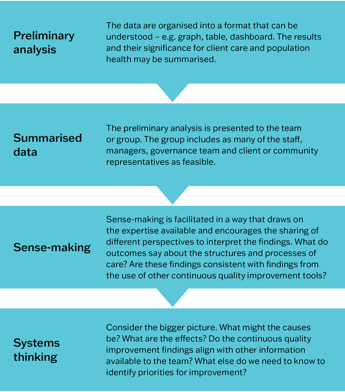
Figure 6.7 The participatory interpretation process.
The importance of local knowledge
It is vital that CQI data are interpreted in the context of the local PHC delivery model. There may be many influences within a PHC setting that are relevant to the interpretation of data. These might include, for example, cultural issues (such as around gender or understandings of health), the effect of health promotion activities on clinical data, the influence of individuals (positive or negative) on the team, and staff capacity. The following examples demonstrate the importance of a participatory approach to data interpretation.
The only staff member trained to use the point-of-care blood-testing machine was on leave for three months. This meant that regular blood glucose testing could not be done. Local knowledge about staff absences was necessary for understanding why delivery of this item of care was lower than expected.
*
The number of clients attending exercise classes for Elders and seniors had dropped significantly over several months, even though participant feedback continued to show a high level of satisfaction with the classes. The drop could not be explained by changes to class delivery or arrangements for transporting participants to the classes. It emerged through discussion that another agency was scheduling social outings for this age group on the same mornings each week.
*
It appeared from clinical audit data that 56 per cent of pregnant women had presented to the clinic before conception for folate supplements – a good news story. This finding didn’t align with the experiences of clinicians. Through team discussion, it became apparent that the folate was included in the iron medication that women were already taking because they were anaemic, rather than folate being specifically prescribed.
*
The number of men presenting for health checks, and before their illnesses became serious, had increased each year for three years. The Aboriginal PHC service had been promoting men’s health checks and had extended opening hours on two evenings each week. While these changes were viewed positively, community feedback confirmed that strategies for embedding culturally appropriate care across the service had most influence on men accessing care. These included employing more Aboriginal staff, training and mentoring in cultural safety for non-Indigenous staff and use of interpreters.
Using systems thinking
CQI tools are designed to collect data about the structure, processes and outcomes of care. Systems thinking is used to make sense of that data (often in conjunction with other techniques) and to plan improvement. Systems thinking is the ability to recognise, understand and synthesise the links, interactions and interdependencies between different parts of a system. It involves looking for these connections and understanding the context in which they occur.21
Systems thinking involves looking for connections between different parts of a system and understanding the context in which they occur.
The examples at the end of the previous section illustrate the use of systems thinking to interpret data. Take the first example. The team connected knowledge about how blood glucose testing was done (the process, equipment used and requirement for special training) with contextual knowledge about people and their roles (who was authorised to use the equipment) and organisational processes (timing of individual leave) to interpret audit data. Continued use of systems thinking will enable the team to plan sustainable system improvements, such as training more staff to use the blood glucose monitor, and coordinating staff leave dates to ensure blood glucose testing is always available to clients. The conversations can help staff to prioritise the next audit: for example, is there a need for data about the quality of preventive care the service or practice is delivering? In contrast, a team using linear thinking may incorrectly attribute the low rate of blood glucose testing to a drop in client attendance or to clinical inertia. Team members would risk focusing improvement efforts on a one-off campaign to educate (possibly already well-informed) clients and colleagues about the importance of diabetes screening and blood glucose monitoring.
Systems thinking includes these skills:
- dynamic thinking – viewing a problem as part of a pattern of system behaviour over time
- system-as-cause thinking – placing responsibility for what is happening on people inside the system who manage the policies and procedures, rather than on external forces
- forest thinking (also called helicopter view) – seeing the bigger picture and understanding the context in which system interactions occur, instead of focusing on details
- operational thinking – focusing on cause and effect, and understanding how system behaviour is generated
- thinking in feedback loops – seeing cause and effect as an ongoing process. A change may be modified when put into action, or it may lead to changes in other parts of the system. Feedback informs further action.22
When systems thinking is used, synergies between parts of the system can be anticipated. Unintended consequences, or negative effects of a change on another part of the system, can be mitigated. A systems thinking approach, which shifts the focus from individual PHC team roles and care processes to the systems in which they work, is essential for understanding and improving the quality of PHC.
Example: establishing a systems thinking approach to improving chronic illness care
The importance of a systems thinking approach for improving health outcomes was established in one of the earliest studies of the ABCD CQI research program. PHC teams in twelve Aboriginal and Torres Strait Islander communities identified resources and areas of strength and weakness in the systems relating to chronic illness care. The study found that all components of the “chronic care model”23 were evident in, and influenced, every facet of PHC centre operations. The components delineated the connections between clients, PHC staff, families and communities. These specific findings were made:
- Organisational influence was strengthened by inclusion of chronic illness goals in business plans and appointment of chronic disease coordinators to conduct clinical audits, but weakened by lack of training in disease prevention and health promotion, and by the funding structure of the time.
- Community linkages were facilitated by PHC teams working with community organisations (for example, local stores) and running community-based programs (for example, Health Week), but weakened by a shortage of staff, especially Aboriginal and Torres Strait Islander health workers.
- Self-management was promoted through client education and goal setting with clients but hindered by limited focus on family and community-based activities due to understaffing.
- Information systems were facilitated by computerised information systems but weakened, at that time, by the systems’ complexity and need for IT maintenance and upgrade support (information systems have greatly improved since the study, including the capacity of electronic information systems to support CQI).
- Decision support for clinicians was facilitated by access to clinical guidelines and their integration with daily care but limited by inadequate access to and support from specialists.
- Delivery system design was strengthened by provision of transport for clients to PHC centres, separate men’s and women’s clinic rooms, specific roles of PHC team members in chronic illness care, effective teamwork, and functional pathology and pharmacy systems, but weakened by staff shortage and high staff turnover.24
In the following story, the PHC team in a remote community used systems thinking to understand a care delivery problem, and to make changes that would bring about sustained improvement.
Story: using systems thinking to make sense of data and plan improvement
“We have done many systems assessments with community health centre teams. We aim to involve all members of the team in the process, which uses the systems assessment tool26 to capture subjective feedback from PHC teams ‘on the ground’ about how well their health centre systems are working.
When asked about patient follow-up and continuity of care, one team said they had a good system in place, and it was working well. But when we reviewed data from their review of clinical records, it actually showed that follow-up was quite poor: patients were falling through the cracks and missing out on care. This came as a shock to everyone: the GP, Aboriginal health practitioners, nurses and drivers who were part of the feedback session.
The team decided to focus on one group of patients to explore what was happening in their recall system: children and adults with acute rheumatic fever and rheumatic heart disease (ARF/RHD). With the local CQI facilitator they reviewed the current recall system, developing a flowchart to identify the weakness in the process. They discussed how those weaknesses affected processes such as providing monthly benzathine penicillin G injections, consultations with the visiting cardiologist and paediatrician, access to translators and education about ARF/RHD in their first language and linking patients with other services. They brainstormed why there were outstanding recalls; there was local knowledge in the room including community members on the PHC team.
They proceeded with a PDSA cycle that had the goal of decreasing the number of outstanding recalls for patients with ARF/RHD over the following two months. Team members reviewed the medical record of every patient in the community diagnosed with ARF/RHD, deleted out-of-date recalls and amended follow-up appointments. This decreased the number of outstanding recalls in the short term. The second PDSA cycle focused on system changes. A weekly recall list was printed for the team members who held the “portfolio” for that group of patients. The team reviewed the patient recall list at daily team meetings, where the knowledge of Aboriginal health practitioners and other local staff, who knew who and where families were, was key to contacting them and for keeping the data base up-to-date.
The team achieved their goal. They significantly decreased the number of outstanding ARF/RHD patient recalls that were printed off at the start of each week and have since put this system into place for other groups of patients. All staff who use the electronic patient information system are trained to enter data correctly as part of their orientation. The work the team did improved and streamlined the recall system, leading to better care and patient outcomes. How did they review this? They saw it in the next round of CQI data!”
– Kerry Copley and Louise Patel, CQI program coordinators, Aboriginal Medical Services Alliance Northern Territory.
For more information, see Aboriginal Medical Services Alliance Northern Territory n.d.
The process mapping and root cause analysis tools described in Chapter 5 are systems thinking tools.
Goal setting
Identifying strengths and priorities for improvement
The participatory interpretation of data shows the team what is being done well and not so well, and the influence of contextual factors on care. It is important to identify and acknowledge strengths, as well as areas where systems need to be improved. For example, consider what strengths and weakness a primary healthcare centre might have for diabetes care:
- strengths: diabetes audit and systems assessment data might indicate a good rate of follow-up for abnormal blood glucose results, that the measuring and recording of blood pressure is embedded as routine practice, that rates of self-management goal setting have improved and that links with the community are strong: that overall, the PHC centre is performing well in diabetes care. Focus on these achievements before discussing the identified gaps in quality of care.
- need for improvement: identified gaps might be low rates of diabetes screening and diagnosis for men, a significant client group with poor blood glucose control, lack of screening for emotional wellbeing, and poor follow-up or lack of records describing the action taken following abnormal blood pressure results.
Not all improvement needs can be tackled at the same time. The identified gaps should be discussed by the team to understand factors that may be contributing to the quality issues, factors that may have a positive influence, and which gaps in care should be prioritised. Remember, CQI is about continuous learning and improvement, not about assigning blame. Group discussion should focus on these points:
- the significance or urgency (or both) of clients’ healthcare needs
- which system changes are more likely to improve the health of this group of clients
- what changes are practical and feasible in your PHC context
- small, incremental improvements that are likely to be sustainable.
Developing SMART goals
After an improvement priority has been identified, an improvement goal is developed. We set improvement goals to answer the question: “what are we trying to accomplish?” (See Chapter 2.)
Agreeing about the goal is critical for a sense of direction and for team commitment, as is allocating the people and resources necessary to achieve the goal. Many organisations use SMART as a guide for developing goals (Figure 6.8).
A numerical goal should be set when possible. A numerical goal directs how achievement will be measured and helps the team to think about the level of support needed: for example, “increase child immunisation rates by 50 per cent within 12 months” rather than “increase child immunisation rates”. Note that numerical goals are not always relevant. For example, goals might focus on improving community and health centre relationships, improving communication and confidence among staff members, or improving the physical environment of the health centre. Non-numerical goals still need to be measurable, for example, by conducting client and staff surveys or focus groups. An aspirational goal stretches the team to look for ways of overcoming barriers to improvement.27
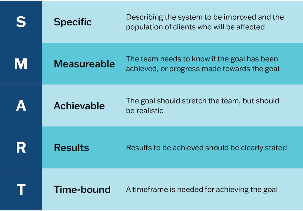
Figure 6.8 SMART goals.
Examples of SMART goals
- Within 3 months, establish a system to identify and follow-up all clients with type 2 diabetes who have abnormal blood pressure and blood glucose results.
- Within 12 months, increase child immunisation rates by 50 per cent.
- Within 18 months, increase screening and follow-up for social risk factors for women receiving antenatal and postnatal care by 60 per cent.
Improvement goals should be regularly reviewed during team meetings. You may need to revise a goal to take account of organisational change or unexpected events (for example, a disease outbreak, a severe weather event) or to refocus on a part of the system over which the team has more influence.
A note about terms: some people prefer the term “aims” to “goals”. Others think of aims as general statements – “Our aim is to improve child immunisation rates” – and goals as more specific (for example, SMART goals). Some teams identify general aims or goals and set SMART “objectives”. And concepts expressed in a language other than English may be most appropriate for your team. As a rule, use terms that feel right for your organisation and setting.
Action planning
Action planning is the process of identifying what actions need to be taken to achieve the improvement goal. We plan actions based on the question: “what changes can we make that will result in an improvement?” (See Chapter 2.)
We plan actions based on the question: “what changes can we make that will result in an improvement?”
Action planning involves these activities:
- developing improvement strategies and measurable activities
- identifying the resources needed
- allocating tasks and responsibilities
- setting milestones and timelines for completing the various activities.
The action planning process may be done in the same session as goal setting, or as a follow-up activity, depending on the people available and the time allocated to the session. As with participatory interpretation of data and goal setting, action planning should be a collective activity. Input from people with different expertise and experiences is important because of the complex nature of improvement in PHC and the difficulty of predicting what will work. Involving as many team members as possible leads to shared understanding and ownership of the action plan. This is particularly important for people who will have a role in implementing the plan, or whose work will be affected by it. Without collective commitment to the action plan, implementation will lack direction and momentum.
Visualise your completed action plan in a way that can be shared and understood by all involved. Options could be a table, an extended driver (or “action effect”) diagram,28 or a chart developed with project management software. CQI action plans typically include the following components:
- goal/s
- strategies
- implementation activities or tasks
- responsibility – people responsible for each activity or task
- milestones or timeline
- resources – needed to complete the activities
- measures – for monitoring and evaluating progress.
Implementation
In our CQI cycle, implementation refers to implementing improvement strategies to achieve system changes in a PHC centre, practice or program. This should be distinguished from using the term specifically to refer to the translation of evidence into practice, and to embedding and sustaining system changes (as commonly used in the field of implementation science).
Implementing your team’s action plan is essential for achieving your improvement goals. This is self-evident, but, consistent with other phases of the CQI cycle in PHC, teams need the right tools for the task. An essential tool in your team’s implementation toolkit is the plan-do-study-act, or PDSA, cycle.
Plan-do-study-act (PDSA) cycles
PDSA cycles29 are usually rapid, small-scale cycles used for developing and testing change strategies (Figure 6.9). PDSA cycles enable teams to gather ongoing feedback about how well their change strategies are working and to adapt those strategies to work more effectively. Multiple PDSA cycles may be needed to optimise a change strategy. The cycles are used to ensure that the strategy has its intended effect and is carried out in a sustainable way without creating unintended consequences.30
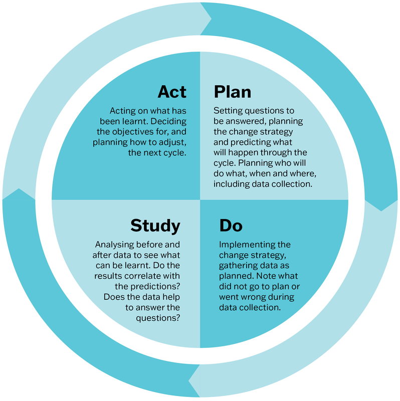
Figure 6.9 The Plan-do-study-act Cycle. Adapted from: Deming, W. Edwards. foreword by Kevin Edwards Cahill, “The New Economics for Industry, Government, Education, third edition”, The PDSA Cycle, page 91 © 2018 Massachusetts Institute of Technology, by permission of The MIT Press.
In Box 6.1, PDSA cycles are used to test a strategy to improve the delivery of follow-up care for adults who had a preventive health assessment with abnormal screening results. Many clients did not attend their follow-up appointments. A common reason given by clients was that they forgot about the appointment.
Box 6.1 Example PDSA cycles
Change strategy: remind clients of their follow-up appointments.
|
|
PDSA cycle 1 |
PDSA cycle 2 |
PDSA cycle 3 |
|---|---|---|---|
|
Plan |
Receptionist to set up system to send date and time reminder text to clients’ mobile phones two weeks before, and one day before their appointments, with request to respond “yes” or “no”, and a number to call to make another appointment if unable to attend. |
Receptionist to call clients to remind them, or to reschedule the appointment. |
Focus on non-attendees. When calling, reinforce the importance of following up on results. Assure clients that rescheduling is possible. Ask if they need support with transport to the health centre. Send reminder letter to clients who can’t be reached by phone. |
|
Prediction: If clients have forgotten the appointment, this will prompt them to attend or to arrange a new appointment time. |
Prediction: A personalised phone call will encourage clients to attend and help to promote a positive service–client relationship. |
Prediction: A personalised caring approach and offer of transport (where possible) should encourage clients to attend or reschedule appointments. | |
|
Measurement: Who – receptionist What – number of clients who are sent a text, number and type of responses (yes/no/none/callback), attendance How – data download from system, spreadsheet When – review after 4 weeks. |
Measurement: Who – receptionist What – number of clients called, number and type of responses, attendance, time taken on calls How – spreadsheet When – review after 4 weeks.
|
Measurement: Who – receptionist and chronic care coordinator What – number of clients called and sent letters, responses, attendance How – spreadsheet When – review after 6 weeks.
| |
|
Do |
Receptionist sends reminder text to clients’ mobile phones. |
Receptionist calls clients with reminders, and records the response to her calls (for example: client confirms the appointment; client does not answer; when “hide caller ID” is used client does not answer). |
Receptionist and chronic care coordinator contact clients as planned noting that this approach is generally well received by targeted clients, and many are grateful for the offer of transport. |
|
Study |
Few clients responded, and those who respond “no” rarely make a new appointment time. Receptionist can’t be sure the messages are being delivered. No improvement in attendance. |
Many clients confirmed their appointments but still missed them. Several clients could not be reached by phone, even after changing to “show caller ID” (as clinic name). Trying to call every client with a follow-up appointment is overly demanding on receptionist’s time. Little improvement in attendance. |
Attendance of follow-up appointments increased from 60 per cent to 80 per cent. |
|
Act |
Team feels the approach is too impersonal or ineffective. See PSDA 2.
|
Team is aware that not many families in the community have motor vehicles. A more time-efficient approach is needed. |
Maintain the focused personalised reminder system. Staff to check/update contact details at each client interaction. |
Staying on track to implement improvement
Implementing CQI action plans and being part of improved quality of care is rewarding for everyone involved. Even so, day-to-day work and acute care demands, changes in staff or management, and unanticipated events may present obstacles to implementation, even for PHC teams who are experienced in CQI.
We recommended several strategies for staying on track to implement planned improvements.
- Communicate improvement plans to all who have a role in implementing CQI.
- Have CQI as a standing item on the agenda for staff meetings. This helps to keep track of the progress of each CQI cycle. It provides opportunities to discuss how strategies are going, and to plan any adjustments that are needed. It is important that information and action items for follow-up are shared among the team and others who are affected or involved.
- Share good news stories about improvements with colleagues and with the community (for example, on a website or in a community newsletter). Share positive feedback from the community among colleagues.
- Put up signs listing improvement goals and achievements. Signs can be displayed in areas used by staff and in client waiting areas.
- Prepare CQI progress reports for the management or governance group or board, or both.
It is important for CQI leaders, facilitators and managers to understand organisational and individual responses to change, and to respond effectively. People resist change for various reasons; they may even feel that their role or work is threatened by the planned changes to systems and care processes. Identifying or creating learning opportunities in CQI and innovation, and in managing change, will support implementation.
Example: implementing improvement strategies for better care coordination
Setting: An Australian health service experienced in using CQI. It has a main clinic with management and administrative staff located in a large regional town. Outreach clinics serve seven small rural communities.
Identified problems: Use of a triage process for clients visiting the main clinic and a lack of coordination meant that clients with diagnosed chronic diseases were required to visit multiple times for routine care. Many were missing important scheduled services. Chronic disease management plans were underused, reducing the potential for government funding of the service.
These strategies were implemented:
- With input from clinicians, managers and systems support staff, a “client-flow nurse” role was created to oversee clinic processes and liaise with clinicians, clients and other services to coordinate care. The role had flexibility to respond to changing local conditions.
- Client-flow processes were restructured. Clients due for chronic disease management appointments were identified and appointments were scheduled.
- Meetings of the clinic team each morning supported teamwork and communication for delivering care (for example, staff rosters, client appointments, hospital admissions and discharges).
- The plan included monitoring and evaluation to find out how well strategies were working and to adjust systems as needed.
Outcomes: Better team knowledge about the care needs of their clients and what was happening in the wider community, better care planning and coordination, increased government funds through chronic disease management plans, and improved community engagement.
“I think the community started to really engage with us again . . . we’d seen some really positive things that were coming out of this service and the community started coming to us with their problems, rather than just trying to muddle through, or use the hospital as a GP service.” – Nurse31
Finally, it is important to keep going with CQI cycles. If changes in the service environment interrupt CQI activities, picking up the process where the last CQI cycle paused and getting involved in practical tasks, for example analysing data, can help a team re-engage in CQI. Above all, don’t abandon your CQI efforts when indicators of quality show minimal improvement. Remember, CQI aims for small changes that are realistic and achievable: changes that can be sustained. It takes time for small, incremental improvements in care quality to be reflected in data, as highlighted in the following reflection by a CQI facilitator.
Reflecting on the importance of ongoing engagement in CQI
“In the early days of the ABCD research program we discovered how important it was for PHC teams to look at data from one CQI cycle to the next. Each participating health service had its own ‘community story’ feedback reports for chronic illness care and preventive care that showed pie charts and bar graphs of clinical audit results and radar plots of the systems assessment results. These results were combined to show where the health team efforts were improving care. Some health services may not have achieved their systems improvement goals in the first CQI cycle, however the data showed positive changes over time. We could see the changes staff were making and they could see improvement in the care they were providing for their clients.”
– Lynette O’Donoghue, CQI facilitator/researcher
Summary
This chapter has described how CQI cycles are used in PHC. We have worked through a CQI cycle that involves the four phases: data collection; data analysis (and understanding causes of variation); participatory interpretation, goal setting and action planning; and implementation. Examples have been used to illustrate concepts and processes within each phase. We presented different types of graphs that can be used in the data analysis phase; we also discussed variation in care quality. We have highlighted the importance of using local knowledge and systems thinking when interpreting data and planning system improvement, and the benefits of continued engagement in CQI cycles. In the next chapter, we describe CQI facilitation and techniques for engaging PHC teams and other PHC stakeholders in CQI cycles.
References
Aboriginal Medical Services Alliance Northern Territory (n.d.). Continuous quality improvement (CQI). http://www.amsant.org.au/cqi-new/.
Bailie, C., V. Matthews, J. Bailie, P. Burgess, K. Copley, C. Kennedy et al. (2016). Determinants and gaps in preventive care delivery for Indigenous Australians: a cross-sectional analysis. Frontiers in Public Health 4: 34. DOI: 10.3389/fpubh.2016.00034.
Bailie, J., A. Laycock, V. Matthews and R. Bailie (2016). System-level action required for wide-scale improvement in quality of primary health care: synthesis of feedback from an interactive process to promote dissemination and use of aggregated quality of care data. Frontiers in Public Health 4: 86. DOI: 10.3389/fpubh.2016.00086.
Bailie, J., V. Matthews, A. Laycock, R. Schultz, C. Burgess, D. Peiris et al. (2017). Improving preventive health care in Aboriginal and Torres Strait Islander primary care settings. Globalization and Health 13: 48. DOI: 10.1186/s12992-017-0267-z.
Bailie, J., G. Schierhout, F. Cunningham, J. Yule, A. Laycock and R. Bailie (2015). Quality of primary health care for Aboriginal and Torres Strait Islander people in Australia. Key research findings and messages for action from the ABCD National Research Partnership Project. Brisbane: Menzies School of Health Research.
Bailie, R., V. Matthews, S. Larkins, S. Thompson, P. Burgess, T. Weeramanthri et al. (2017). Impact of policy support on uptake of evidence-based continuous quality improvement activities and the quality of care for Indigenous Australians: a comparative case study. BMJ Open 7(10). DOI: 10.1136/bmjopen-2017-016626.
Bailie, R.S., D. Si, L. O’Donoghue and M. Dowden (2007). Indigenous health: effective and sustainable health services through continuous quality improvement. Medical Journal of Australia 186(10): 525–7. DOI: 10.5694/j.1326-5377.2007.tb01028.x.
Bonomi, A.E., E.H. Wagner, R.E. Glasgow and M. VonKorff (2002). Assessment of chronic illness care (ACIC): a practical tool to measure quality improvement. Health Services Research 37(3): 791–820. DOI: 10.1111/1475-6773.00049.
Bowen, M.E. and D. Neuhauser (2013). Understanding and managing variation: three different perspectives. Implementation Science 8(1): S1. DOI: 10.1186/1748-5908-8-S1-S1.
Brands, J., J. Griffin, R. Bailie, J. Hains, R. Cox, C. Kennedy et al. (2010). Improving the quality of primary health care: a training manual for the One21seventy cycle. Darwin: Menzies School of Health Research.
Burnett, A., A. Morse, T. Naduvilath, A. Boudville, H. Taylor and R. Bailie (2016). Delivery of eye and vision services in Aboriginal and Torres Strait Islander primary healthcare centers. Frontiers in Public Health 4: 276. DOI: 10.3389/fpubh.2016.00276.
de Savigny, D. and T. Adam, eds (2009). Systems thinking for health systems strengthening. Geneva: Alliance for Health Policy and Systems Research, World Health Organization.
Deming, W. Edwards (2018). The New Economics for Industry, Government, Education. 3rd edn. Cambridge, MA: MIT Press.
Dolansky, M. and S. Moore (2013). Quality and safety education for nurses (QSEN): the key is systems thinking. Online Journal of Issues in Nursing 18(3): 1. DOI: 10.3912/OJIN.Vol18No03Man01.
Evergreen, S. (2024). Evergreen data: intentional reporting and data visualization. https://stephanieevergreen.com/.
Gibson-Helm, M., H. Teede, A. Rumbold, S. Ranasinha, R. Bailie and J. Boyle (2015). Continuous quality improvement and metabolic screening during pregnancy at primary health centres attended by Aboriginal and Torres Strait Islander women. Medical Journal of Australia 203(9): e1–7. DOI: 10.5694/mja14.01660.
Halperin, I., J. Gilmour, P. Segal, L. Sutton, R. Wong, L. Caplan et al. (2019). Determining root causes and designing change ideas in a quality improvement project. Canadian Journal of Diabetes 43 (4): 241–8. DOI: 10.1016/j.jcjd.2019.03.001.
Institute for Healthcare Improvement (2021). Science of improvement: tips for setting aims. How to improve. https://www.ihi.org/how-improve-model-improvement-setting-aims.
Larkins, S., K. Carlisle, N. Turner, J. Taylor, K. Copley, S. Cooney et al. (2019). “At the grass roots level it’s about sitting down and talking”: exploring quality improvement through case studies with high-improving Aboriginal and Torres Strait Islander primary healthcare services. BMJ Open
9 (5): e027568. DOI: 10.1136/bmjopen-2018-027568.
Laycock, A., G. Harvey, N. Percival, F. Cunningham, J. Bailie, V. Matthews et al. (2018). Application of the i-PARIHS framework for enhancing understanding of interactive dissemination to achieve wide-scale improvement in Indigenous primary healthcare. Health Research Policy and Systems 16: 117. DOI: 10.1186/s12961-018-0392-z.
Matthews, V., J. Bailie, A. Laycock, T. Nagel and R. Bailie (2016). Aboriginal and Torres Strait Islander mental health and wellbeing care: final report, ESP Project. Brisbane: Menzies School of Health Research.
Matthews, V., C. Burgess, C. Connors, E. Moore, D. Peiris, D. Scrimgeour et al. (2017). Integrated clinical decision support systems promote absolute cardiovascular risk assessment: an important primary prevention measure in Aboriginal and Torres Strait Islander primary health care. Frontiers in Public Health 5: 233. DOI: 10.3389/fpubh.2017.00233.
Matthews, V., C. Connors, A. Laycock, J. Bailie and R. Bailie (2015). Chronic illness care for Aboriginal and Torres Strait Islander people: final report. ESP Project: priority evidence-practice gaps and stakeholder views on barriers and strategies for improvement. Brisbane: Menzies School of Health Research.
Matthews, V., G. Schierhout, J. McBroom, C. Connors, C. Kennedy, R. Kwedza et al. (2014). Duration of participation in continuous quality improvement: a key factor explaining improved delivery of type 2 diabetes services. BMC Health Services Research 14(1): 578. DOI: 10.1186/s12913-014-0578-1.
McAullay, D., K. McAuley, R. Bailie, V. Mathews, P. Jacoby, K. Gardner et al. (2018). Sustained participation in annual continuous quality improvement activities improves quality of care for Aboriginal and Torres Strait Islander children. Journal of Paediatrics and Child Health 54(2): 132–40. DOI: 10.1111/jpc.13673.
Menzies School of Health Research and One21seventy (2012). Systems assessment tool – all client groups. Darwin: Menzies School of Health Research.
Nattabi, B., V. Matthews, J. Bailie, A. Rumbold, D. Scrimgeour, J. Ward et al. (2017). Wide variation in sexually transmitted infection testing and counselling at Aboriginal primary health care centres in Australia: analysis of longitudinal continuous quality improvement data. BMC Infectious Diseases 17: 148. DOI: 10.1186/s12879-017-2241-z.
Newham, J. and F. Cunningham (2015). Continuous quality improvement success stories: identifying effective strategies for CQI in Aboriginal and Torres Strait Islander primary health care – study report. ABCD National Research Partnership. Brisbane: ABCD National Research Partnership, Menzies School of Health Research.
Ralph, A., M. Fittock, R. Schultz, D. Thompson, M. Dowden, T. Clemens et al. (2013). Improvement in rheumatic fever and rheumatic heart disease management and prevention using a health centre-based continuous quality improvement approach. BMC Health Services Research 13: 525. DOI: 10.1186/1472-6963-13-525.
Reed, J., C. McNicholas, T. Woodcock, L. Issen and D. Bell (2014). Designing quality improvement initiatives: the action effect method, a structured approach to identifying and articulating programme theory. BMJ Quality and Safety 23(12): 1040–8. DOI: 10.1136/bmjqs-2014-003103.
Schierhout, G., V. Matthews, C. Connors, S. Thompson, R. Kwedza, C. Kennedy et al. (2016). Improvement in delivery of type 2 diabetes services differs by mode of care: a retrospective longitudinal analysis in the Aboriginal and Torres Strait Islander primary health care setting. BMC Health Services Research 16: 560. DOI: 10.1186/s12913-016-1812-9.
Si, D., R. Bailie, J. Cunningham, G. Robinson, M. Dowden, A. Stewart et al. (2008). Describing and analysing primary health care system support for chronic illness care in Indigenous communities in Australia’s Northern Territory – use of the Chronic Care Model. BMC Health Services Research 8: 112. DOI: 10.1186/1472-6963-8-112.
Timothy, A., D. Coetzee, C. Morgan, M. Kelaher, R. Bailie and M. Danchin (2021). Using an adaptive, codesign approach to strengthen clinic-level immunisation services in Khayelitsha, Western Cape Province, South Africa. BMJ Global Health 6(3): e004004. DOI: 10.1136/bmjgh-2020-004004.
Vasant, B., V. Matthews, C. Burgess, C. Connors and R. Bailie (2016). Wide variation in absolute cardiovascular risk assessment in Aboriginal and Torres Strait Islander people with type 2 diabetes. Frontiers in Public Health 4: 37. DOI: 10.3389/fpubh.2016.00037.
Woods, C., K. Carlisle, S. Larkins, S. Thompson, K. Tsey, V. Matthews et al. (2017) Exploring systems that support good clinical care in Indigenous primary health-care services: a retrospective analysis of longitudinal systems assessment tool data from high-improving services. Frontiers in Public Health 5: 45 . DOI: 10.3389/fpubh.2017.00045.
1 Bailie, Si et al. 2007.
2 Timothy, Coetzee et al. 2021.
3 Woods, Carlisle et al. 2017.
4 To access Evergreen Data resources, see Evergreen 2024.
5 J. Bailie, Matthews et al. 2016; Burnett, Morse et al. 2016; Matthews, Burgess et al. 2017.
6 J. Bailie, Laycock et al. 2016; Schierhout, Matthews et al. 2016.
7 Matthews, Schierhout et al. 2014.
8 Burnett, Morse et al. 2016.
9 J. Bailie, Matthews et al. 2016; J. Bailie, Matthews et al. 2017.
10 Matthews, Burgess et al. 2017; Vasant, Matthews et al. 2016.
11 Gibson-Helm, Teede et al. 2015.
12 McAullay, McAuley et al. 2018.
13 Ralph, Fittock et al. 2013.
14 Nattabi, Matthews et al. 2017.
15 Burnett, Morse et al. 2016; Nattabi, Matthews et al. 2017; Schierhout, Matthews et al. 2016; Vasant, Matthews et al. 2016.
16 Bailie, Matthews et al. 2016; R. Bailie, Matthews et al. 2017; Matthews, Burgess et al. 2017.
17 J. Bailie, Schierhout et al. 2015; Larkins, Carlisle et al. 2019; Laycock, Harvey et al. 2018.
18 Bowen and Neuhauser 2013.
19 Bowen and Neuhauser 2013.
20 Brands, Griffin et al. 2010.
21 de Savigny and Adam 2009; Dolansky and Moore 2013.
22 de Savigny and Adam 2009.
23 Bonomi, Wagner et al. 2002.
24 Si, Bailie et al. 2008.
25 Menzies School of Health Research and One21seventy 2012.
26 Menzies School of Health Research and One21seventy 2012.
27 Institute for Healthcare Improvement 2021.
28 Reed, McNicholas et al. 2014.
29 Deming 2018.
30 Halperin, Gilmour et al. 2019.
31 Newham and Cunningham 2015, 27.